
UX DESIGN
5 MINS
The tactile charm of micro-interactions
The tactile charm of micro-interactions
Laxmi Mahajan, UX designer at Canvs talks about her thoughts on micro-interactions — how they’ve evolved and why these small design choices matter so much in the digital world, and in the real world as well. She also shares examples from products she uses every day, and talks about how insights from data can make these moments of user delight even better
It’s 7:30 AM, and my phone’s alarm gradually increases in volume — a thoughtful, tiny interaction that eases me into consciousness rather than jolting me awake. As I reach for my phone, the familiar haptic feedback of the “slide to stop” gesture marks the official start of my day. This moment, though small, sets the tone for the countless subtle interactions that will shape my next 24 hours.
It’s 7:30 AM, and my phone’s alarm gradually increases in volume — a thoughtful, tiny interaction that eases me into consciousness rather than jolting me awake. As I reach for my phone, the familiar haptic feedback of the “slide to stop” gesture marks the official start of my day. This moment, though small, sets the tone for the countless subtle interactions that will shape my next 24 hours.
What are micro-interactions?
What are micro-interactions?
These are small moments that make an interface or product feel alive. They’re the animations, sounds, haptics, and visual cues that guide users, provide feedback, and add personality to a product. When done well, they’re invisible yet indispensable, turning mundane tasks into delightful experiences.
What’s more, micro-interactions are everywhere, from physical objects to digital apps.

IBM’s typewriter style keyboard
IBM’s typewriter style keyboard
Looking back, briefly:
Looking back, briefly:
IBM was one of the first companies to add basic micro-interactions in the form of feedback mechanisms within early computers. Their typewriter-style keyboards with tactile feedback (the “click” sound of each keystroke) were an early precursor to what we now see as micro-interactions in digital products.
When the first Macintosh computer was introduced in 1984, it brought intuitive visual feedback in the form of simple things like: the mouse pointer changing to a hand when hovering over a link, and the trash can icon animation when dragging files to delete. These small touches provided users with meaningful feedback that transformed basic computing tasks into something more engaging.

Mac’s classic cursors
Mac’s classic cursors
"Micro-interactions are everywhere, from physical objects to digital apps."
"Micro-interactions are everywhere, from physical objects to digital apps."
A few examples of early micro-interactions
A few examples of early micro-interactions
Older interface animations laid the foundation for how we experience digital interactions today.
Older interface animations laid the foundation for how we experience digital interactions today.
Apple
Apple
The launch of the iPhone (in 2017) brought micro-interactions to the mainstream. The iconic slide-to-unlock gesture was simple yet profound. The visual change and tactile feedback as you slid your finger across the screen made unlocking the phone more than just functional—it became an experience.
The launch of the iPhone (in 2017) brought micro-interactions to the mainstream. The iconic slide-to-unlock gesture was simple yet profound. The visual change and tactile feedback as you slid your finger across the screen made unlocking the phone more than just functional—it became an experience.
Pull-to-refresh
Pull-to-refresh
Another key figure is Loren Brichter, a designer and developer, who created the famous “pull-to-refresh” interaction for the Twitter app in 2009. This feature was revolutionary because it transformed a mundane task (reloading content) into something visually engaging and interactive.
The gesture itself — pulling down on the screen to refresh content — was incredibly satisfying, with a small bounce-back animation and a dynamic progression of loading content. It quickly became a defining feature of mobile interfaces and influenced countless apps that adopted similar gestures.
Google's Material Design (2014)
Google's Material Design (2014)
When Google introduced Material Design in 2014, it took micro-interactions to a whole new level. The guidelines brought subtle animations, smooth transitions, and feedback loops that helped users navigate digital experiences with ease.
Think floating action buttons (FABs) and those smooth screen-to-screen transitions that made everything feel so fluid. It wasn’t just about pretty animations; they made the experience more intuitive and responsive. Google also made sure these interactions stayed consistent across devices, so whether you were on your phone, tablet, or desktop, the experience always felt familiar.
"These small touches provide users with meaningful feedback that transforms basic computing tasks into something more engaging."
"These small touches provide users with meaningful feedback that transforms basic computing tasks into something more engaging."
Interactions in the physical world
Interactions in the physical world
We feed on our senses to know how a certain thing functions. We touch, feel, hear, and see countless products every day, but we often overlook how well-designed they are. It’s only when something goes wrong that we notice the little details we usually take for granted.
And it’s not just about function, micro-interactions can also add a layer of socio-economic meaning to a product’s design. The way something feels or responds can signal quality, status, or even the brand’s identity.

Let’s illustrate this with a couple of examples in the physical world:
Let’s illustrate this with a couple of examples in the physical world:
Car manufacturers, especially BMW, invest in the sound and feel of door closings. The “good door closing sound” is engineered to convey quality to our brains. Every tactile touchpoint — from the resistance in control knobs, the weight of buttons to the sound of turn signals, is meticulously designed based on extensive research into human perception and expectation.
The way a door handle responds to touch is another example of careful engineering. A well-designed handle gives immediate tactile feedback: a subtle resistance, followed by a smooth click. These interactions are so refined and become so familiar that any deviation, like a loose handle, is easily noticeable.
The Apple AirPods Pro case demonstrates yet another instance of sophisticated design. When you close the case, the precise magnetic pull, paired with digital feedback (a sound and haptic buzz on your iPhone), confirms the case is closed and charging. This makes a simple interaction feel complete and satisfying.

Daily life made fun: Apps I use every day
Daily life made fun: Apps I use every day
Let me walk you through a day in my life where these tiny moments make all the difference, and where micro-interactions aid in visual storytelling.
Let me walk you through a day in my life where these tiny moments make all the difference, and where micro-interactions aid in visual storytelling.
Uber
Uber
I love how the Uber app lets me track my ride progress right from my phone’s lock screen. Without unlocking my phone, I can see all the key details, like my driver’s ETA and car model. As the car moves toward me, I can actually watch the progress in real time. It’s a small but thoughtful feature that makes the whole experience feel more engaging. It keeps me in the loop and adds a sense of control, easing any anxiety while I wait for my ride to pick me up.
I love how the Uber app lets me track my ride progress right from my phone’s lock screen. Without unlocking my phone, I can see all the key details, like my driver’s ETA and car model. As the car moves toward me, I can actually watch the progress in real time. It’s a small but thoughtful feature that makes the whole experience feel more engaging. It keeps me in the loop and adds a sense of control, easing any anxiety while I wait for my ride to pick me up.

Clash of Clans:
Clash of Clans:
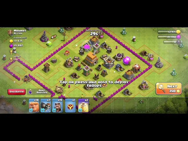
My latest obsession is the game, Clash of Clans. I marvel at how well this game is designed, everything feels like it’s just in the right place. A particular interaction that’s absolutely caught my eye is the ‘searching for an opponent’ feature. What could’ve been a boring loading screen is transformed into a moment of anticipation that reveals your opponent's base. The multi-layered cloud movement adds depth and drama to what's essentially a waiting period. It's a brilliant example of turning technical necessity into a narrative opportunity.
My latest obsession is the game, Clash of Clans. I marvel at how well this game is designed, everything feels like it’s just in the right place. A particular interaction that’s absolutely caught my eye is the ‘searching for an opponent’ feature. What could’ve been a boring loading screen is transformed into a moment of anticipation that reveals your opponent's base. The multi-layered cloud movement adds depth and drama to what's essentially a waiting period. It's a brilliant example of turning technical necessity into a narrative opportunity.
Google lens AI search feature:
Google lens AI search feature:
Pinterest and Instagram are full of 'What's that?' moments. Before, finding answers meant digging through links or comments, hoping someone had asked the same question. Now, tapping the Google Lens icon on an image instantly reveals product details, the location of the place, brands, and prices. It's a few taps that transform a frustrating search into instant discovery.
Pinterest and Instagram are full of 'What's that?' moments. Before, finding answers meant digging through links or comments, hoping someone had asked the same question. Now, tapping the Google Lens icon on an image instantly reveals product details, the location of the place, brands, and prices. It's a few taps that transform a frustrating search into instant discovery.
Spotify's controversial change
Spotify's controversial change
Not all micro-interaction changes are celebrated. When Spotify replaced their heart icon with a plus sign for adding songs to favourites, they broke a familiar pattern that users like me had grown to love. The new interaction, while technically functional, lacks the emotional resonance of the heart animation. It's a reminder that micro-interactions aren't just about function – they're about feeling.
Not all micro-interaction changes are celebrated. When Spotify replaced their heart icon with a plus sign for adding songs to favourites, they broke a familiar pattern that users like me had grown to love. The new interaction, while technically functional, lacks the emotional resonance of the heart animation. It's a reminder that micro-interactions aren't just about function – they're about feeling.

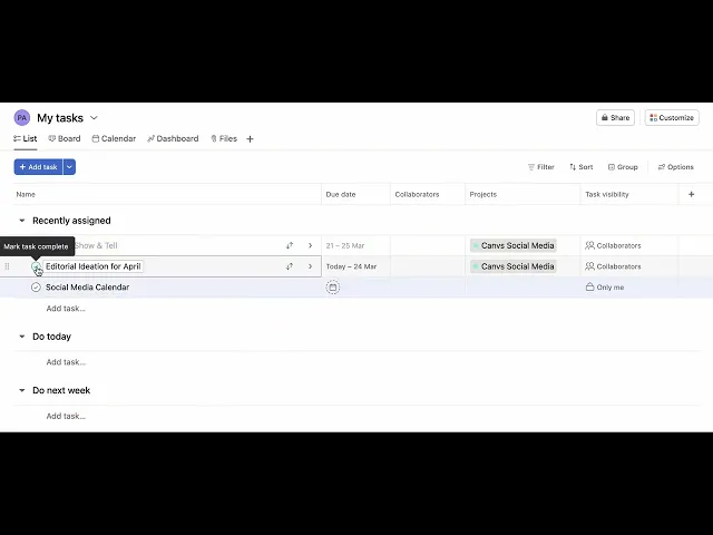
Asana
Asana
Asana’s animation of a mythical creature flying across your screen when you check off a task is a great example of a design that delights. It makes a simple task feel rewarding and gives you a sense of accomplishment.
Asana’s animation of a mythical creature flying across your screen when you check off a task is a great example of a design that delights. It makes a simple task feel rewarding and gives you a sense of accomplishment.
Micro-interactions drive big decisions
Micro-interactions drive big decisions
Companies didn’t stumble on these ideas—they observed how we use their apps, tested things out, and made changes that felt intuitive. It’s a reminder that small details, like a button animation or gesture, can completely change the way people engage with a product.
Big companies make design changes by combining data-driven insights, user feedback, and a deep understanding of behavioural psychology.
Here’s how they typically spot the need for change and implement it:
User behavior analytics
User behavior analytics
Companies use analytics tools like Google Analytics, Mixpanel, or Amplitude to track user interactions with their apps.
Metrics such as bounce rate, time spent on the app, conversion rates, and feature adoption help identify where users may be dropping off or facing challenges.
For example, Facebook's like button: User behavior analysis revealed that people wanted a quick, simple way to acknowledge posts without needing to comment. This insight led to the introduction of the Like button, followed by reactions like "Haha," "Love," and more.

A/B Testing
A/B Testing
Companies often run A/B tests (or multivariate tests) to compare different versions of a design or interaction.
They test subtle micro-interactions, such as button animations, haptic feedback, or progress indicators, to see which version drives higher engagement or satisfaction.
For example, Instagram's double-tap to like:
This gesture likely went through testing to confirm it was intuitive and contributed to significantly increasing likes as compared to a dedicated button.
User feedback
User feedback
Direct feedback from users through app reviews, surveys, and interviews often sheds light on what feels clunky, confusing, or unintuitive.
For example, Headspace’s animations:
Headspace added breathing animations and haptic feedback that syncs with guided meditations after users requested more immersive mindfulness experiences.

Competitor analysis
Competitor analysis
Monitoring competitor apps also helps companies identify successful design trends and micro-interactions that improve engagement.
For example, LinkedIn's profile tracker: Inspired by gamification in other apps (like Duolingo), LinkedIn added a progress bar to encourage users to complete their profiles.

Usability testing
By conducting usability tests with real users, companies observe how people interact with their app in real-time.
Insights from these tests reveal pain points, inefficiencies, or areas where users expect feedback but don’t receive it.
For example, Slack’s typing interaction:
Usability testing revealed that typing indicators and playful animations create a better sense of real-time collaboration.


Ultimately, micro-interactions matter because they make tech feel more human
As a designer, I’m reminded that great experiences aren't built on grand gestures but on countless thoughtful details. Each one is an opportunity to make technology feel more human, more responsive, and more delightful.
When I design interfaces now, I think about how each micro-interaction, however small, contributes to the user's story. Because ultimately, that's what we're designing – not just interfaces, but moments that make up the stories of people's daily lives.
The next time you notice a micro-interaction, remember: you're experiencing the subtle symphony of intentional design that surrounds us.
After all, life itself is made up of small moments – and our designs should celebrate them too!
Canvs is an interface design and engineering studio based in Mumbai, India. We are group design partners to some of India’s market leaders in Banking and Finance and have been around since 2016.