
“We’ll fix accessibility in the next redesign.”
Almost every product team has said this at some point, and it sounds okay, strategic even. It also guarantees that accessibility never actually gets fixed because redesigns are rare and take a lot of time. Besides, they almost never address the systems that caused the problem in the first place.
When you build a product, it's because you've identified a gap, and you want to serve a need. In mainstream products especially banking, payments, food delivery, transport, government platforms, the intent is usually implicit: this should work for everyone who needs it.
But somewhere along the way, this idea of "everyone" ends up being meaning only the mainstream.
But somewhere along the way, this idea of "everyone" ends up being meaning only the mainstream.
But somewhere along the way, this idea of "everyone" ends up being meaning only the mainstream.
In the building process, speed and consistency take the lead. Brand language and business realities take priority, design systems are built around the most visible users, and roadmaps take into consideration the most common flows. Amidst all of this, often without ill-intent, accessibility slips into the zone of a compliance checklist.
Anything that slows things down becomes an edge case that's documented, then deprioritized, and then possibly forgotten as other, more urgent releases and fixes come up.
Over time, these decisions form the bedrock of live products.
And then there’s an audit or a new court ruling, a new circular or a user complaint on social media, and accessibility comes back into the conversation. This time it’s not a design question, but a problem to deal with. Teams take a look at the product and reach the same conclusion again:
”We’ve already shipped this, we’ll fix it later.”
“People’s touchpoints with each other and with society are full of mismatched interactions. Design is a source of these mismatches, and can also be a remedy.”
“People’s touchpoints with each other and with society are full of mismatched interactions. Design is a source of these mismatches, and can also be a remedy.”
“People’s touchpoints with each other and with society are full of mismatched interactions. Design is a source of these mismatches, and can also be a remedy.”
Why accessibility feels “too late” once a product is live
Why accessibility feels “too late” once a product is live
Most accessibility issues aren’t found in isolated components or screens. They’re a part of the overall user journey, functionality and site or app structure. This is because they take root early in decisions that feel neutral at the time.
Decisions about how typography scales, how colours are tokenised, how components are labelled, how error states are communicated, and how confirmation is conveyed after an action is made. These often presume the user’s sight, speed and precision, and don’t just break one screen, but have a cascading effect on all.
Once these assumptions are embedded into a design system or codebase, they’re not “issues” anymore, they’re “just how the product works.” Changing them feels risky because the impact is not localised. A small fix can threaten to ripple across flows, layouts and also teams.
The accruing accessibility debt problem
The accruing accessibility debt problem
Slowly, the debt builds up. The bugs turn into a structural condition, and one that’s hard to address precisely because it touches so much of the product at once.
Meanwhile, the product is also functioning, but selectively. It works fine when you can see well, read well at default sizes, tap accurately at all manner of targets, and make sense of visual feedback when something fails. But for a user who can’t do those things, the experience frays. It doesn’t fully collapse, but it does become uncertain, and independence erodes.
So, how do you begin to address all of this?
So, how do you begin to address all of this?
Before you dive into fixes, do an accessibility audit of your product. This will give you at hand a to-do list or roadmap of accessibility problems.
Before you dive into fixes, do an accessibility audit of your product. This will give you at hand a to-do list or roadmap of accessibility problems.
Start with incremental fixes
You can prioritise what to fix instead of a full overhaul, and a more manageable set of incremental improvements will still improve the experience by a degree.
You can prioritise what to fix instead of a full overhaul, and a more manageable set of incremental improvements will still improve the experience by a degree.
Use automated scanning tools
Tools like axe, Wave or Lighthouse can help catch a portion of common issues like missing alt text, low contrast and so on.
Tools like axe, Wave or Lighthouse can help catch a portion of common issues like missing alt text, low contrast and so on.
b. Do manual accessibility testing
Increase your browser’s text size or use zoom to see if layouts are breaking to check for responsive or text-scaling issues.
Increase your browser’s text size or use zoom to see if layouts are breaking to check for responsive or text-scaling issues.
Navigate your app using only a keyboard to make sure all interactive elements can be reached and used without a mouse.
Navigate your app using only a keyboard to make sure all interactive elements can be reached and used without a mouse.
Test with screen readers like VoiceOver, NVDA or Talkback to check that content is announced in a logical order, images have appropriate descriptions, forms and buttons are labelled correctly, and all errors are conveyed with audio.
Test with screen readers like VoiceOver, NVDA or Talkback to check that content is announced in a logical order, images have appropriate descriptions, forms and buttons are labelled correctly, and all errors are conveyed with audio.
You can also consider other assistive tech, like screen magnifiers or high-contrast modes, for a more thorough evaluation.
You can also consider other assistive tech, like screen magnifiers or high-contrast modes, for a more thorough evaluation.
c. Evaluate the issues against accessibility standards
This way you can eventually arrive at a point where you’re meeting Level AA compliance, which is the typical legal baseline.
This way you can eventually arrive at a point where you’re meeting Level AA compliance, which is the typical legal baseline.
d. Prioritise your fixes
This will make the usability experience much better with minimal disruption. These could be adding missing alt text, or fixing the heading structure, boosting the color contrast or improving screen reader support.
This will make the usability experience much better with minimal disruption. These could be adding missing alt text, or fixing the heading structure, boosting the color contrast or improving screen reader support.
e. Execute a triage-based rollout
Have a triage roll-out where critical issues and blockers get fixed immediately, and then larger redesigns like reworking a complex widget, can be marked for later.
Have a triage roll-out where critical issues and blockers get fixed immediately, and then larger redesigns like reworking a complex widget, can be marked for later.
Once you have this roadmap, your design and engineering teams can start work on the fixes.
Once you have this roadmap, your design and engineering teams can start work on the fixes.
2. Revisit foundational design decisions
Even if your design system wasn’t initially built with accessibility in mind, it’s rarely a dead end. You can retrofit inclusive design into it. For this, you need to start by revisiting foundational style choices, such as colors, typography and spacing.
Even if your design system wasn’t initially built with accessibility in mind, it’s rarely a dead end. You can retrofit inclusive design into it. For this, you need to start by revisiting foundational style choices, such as colors, typography and spacing.
Establish clear colour meaning and non-colour cues
In a live product, colour accessibility usually isn’t broken because someone picked the wrong shade of red. It’s broken because that red stops meaning one clear thing.
When the same red is used for errors, for emphasis, and for destructive actions, users can’t tell what kind of situation they’re in without stopping to think. And accessibility really breaks the moment users have to decode the interface instead of reading it instinctively.
This matters more for people who see less of the screen at once because they’re zoomed in, using magnification, or just processing more slowly. They don’t have the luxury of scanning the whole page for context. If a colour doesn’t reliably tell them “this is an error” or “this needs attention,” interactions can become question marks.
"It also messes with accessibility cues. Colour is supposed to reinforce labels, structure, and behaviour. When its meaning shifts, those cues fall out of sync."
"It also messes with accessibility cues. Colour is supposed to reinforce labels, structure, and behaviour. When its meaning shifts, those cues fall out of sync."
"It also messes with accessibility cues. Colour is supposed to reinforce labels, structure, and behaviour. When its meaning shifts, those cues fall out of sync."
It also messes with accessibility cues. Colour is supposed to reinforce labels, structure, and behaviour. When its meaning shifts, those cues fall out of sync. A screen reader might announce an error, but visually it looks like a highlight. Now different users are getting different signals from the same screen.
That’s why this can’t be fixed screen by screen because the problem isn’t in the UI, but in the system itself. Colour meaning lives in the design system. If that isn’t stable there, it won’t be stable anywhere.
Here are a few do's and don'ts that can help you:
Make sure your product’s colour palette provides enough contrast.
If contrast is low, people quite literally can’t read or identify what’s interactive, especially outside ideal conditions.
There should be enough contrast between:
the text and the background
interactive elements and their surroundings
The recommendation from WCAG guidelines is at least a 4:5:1 contrast ratio for normal text and 3:1 for large text. Falling short here affects users with visual impairments, and also makes content harder to read for other users in low light, on older screens or even when someone is fatigued.
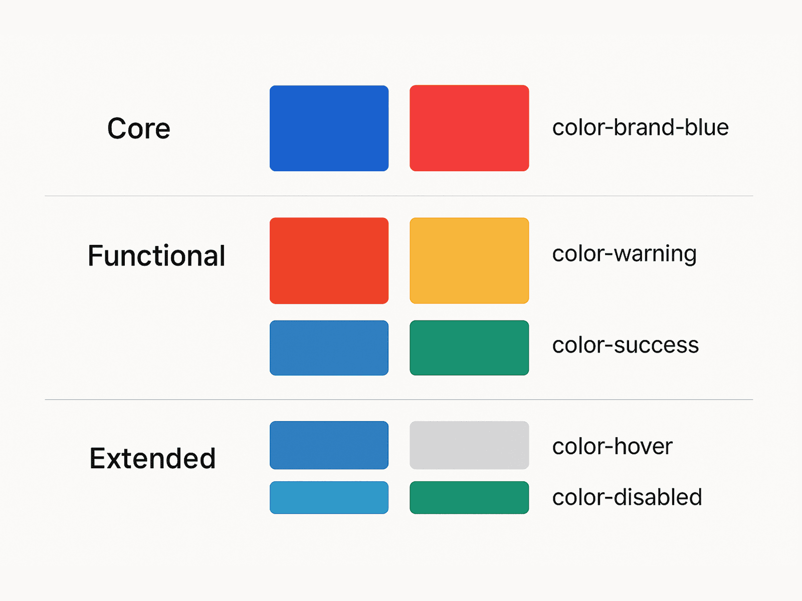
While your core palette holds brand colors that are more about emotion and identity, functional colours focus on usability and help with visual cues like errors, alerts and background distinctions. Similarly, having an extended palette helps with different states.
If contrast is low, people quite literally can’t read or identify what’s interactive, especially outside ideal conditions.
There should be enough contrast between:
the text and the background
interactive elements and their surroundings
The recommendation from WCAG guidelines is at least a 4:5:1 contrast ratio for normal text and 3:1 for large text. Falling short here affects users with visual impairments, and also makes content harder to read for other users in low light, on older screens or even when someone is fatigued.
While your core palette holds brand colors that are more about emotion and identity, functional colours focus on usability and help with visual cues like errors, alerts and background distinctions. Similarly, having an extended palette helps with different states.
b. Use contrast checkers on real UI elements
Running a contrast checker on sample screens isn’t enough. Contrast needs to be checked where it actually matters: primary buttons, secondary text, helper labels, error messages, and disabled states.
This is important because contrast failures are often contextual. A colour might pass against white, but fail against a tinted card background. Or it might work for large headings but not for body text.
Checking contrast at the element level helps you catch these mismatches early, instead of discovering them later through audits or complaints.

On LinkedIn, A Paytm user flagged a legibility and contrast issue being faced by his mother while using the app. The team responded with the fix below. (Source)

c. Fix colour issues where they originate, the token layer
Before you change anything, list and inventory all colour tokens currently used, and where they’ve been used, such as text, backgrounds, borders, icons, charts, and states like hover, active, disabled, and error.
This will show where the same tokens have been used for multiple purposes, like text, decoration and system states.
d. Replace raw colour values with meaning-based tokens
For instance, if your system relies on tokens like this:
<blue-500>>
<red-300>
or <grey-700
then, colour meaning lives in people’s minds. Someone has to remember what each colour stands for. And that memory won’t stay consistent across teams or time.
In an accessible design system, the colour token architecture describes purpose and should look like this:
<text-primary>
<text-secondary>
<action-primary>
<status-error>
Google's Material Design 3, released in 2021, introduced a refined color system based on semantic tokens like color-primary and color-on-primary. These tokens allow for flexible theming (like light/dark mode) and ensure accessibility through contrast-aware design. This token-based system is used across Google's ecosystem—including Gmail, Google Drive, and Android—helping teams scale design consistently and maintain visual coherence across products.
Google's Material Design 3, released in 2021, introduced a refined color system based on semantic tokens like color-primary and color-on-primary. These tokens allow for flexible theming (like light/dark mode) and ensure accessibility through contrast-aware design. This token-based system is used across Google's ecosystem—including Gmail, Google Drive, and Android—helping teams scale design consistently and maintain visual coherence across products.
Google's Material Design 3, released in 2021, introduced a refined color system based on semantic tokens like color-primary and color-on-primary. These tokens allow for flexible theming (like light/dark mode) and ensure accessibility through contrast-aware design. This token-based system is used across Google's ecosystem—including Gmail, Google Drive, and Android—helping teams scale design consistently and maintain visual coherence across products.
Google's Material Design 3, released in 2021, introduced a refined color system based on semantic tokens like color-primary and color-on-primary. These tokens allow for flexible theming (like light/dark mode) and ensure accessibility through contrast-aware design. This token-based system is used across Google's ecosystem—including Gmail, Google Drive, and Android—helping teams scale design consistently and maintain visual coherence across products.
Google's Material Design 3, released in 2021, introduced a refined color system based on semantic tokens like color-primary and color-on-primary. These tokens allow for flexible theming (like light/dark mode) and ensure accessibility through contrast-aware design. This token-based system is used across Google's ecosystem—including Gmail, Google Drive, and Android—helping teams scale design consistently and maintain visual coherence across products.
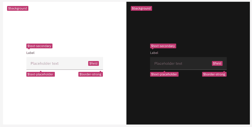
e. Use semantic tokens and test them in pairs
Tokens like Primary, Success, Warning, Error are only useful if they work in the contexts they’re used in. That means testing token pairings, not individual colours.
For example:
Does <
status-error-text> meet 4.5:1 against all approved surfaces?Does <
text-secondary>ever get placed on backgrounds it can’t support
This is how teams move from “we should remember contrast” to “the system enforces it.”
f. Never rely on colour alone to convey meaning
If an input error state is indicated by a red outline, also include an icon or text message. If a button’s active state is shown by colour, also provide a shape or label change.
If an input error state is indicated by a red outline, also include an icon or text message. If a button’s active state is shown by colour, also provide a shape or label change.
g. Consider offering a high-contrast theme or mode for users who need it
This is specially so in the case of apps where users often review dense data like fintech apps. A high-contrast theme with blacks/whites or high-contrast colours can greatly help low-vision users.
This is specially so in the case of apps where users often review dense data like fintech apps. A high-contrast theme with blacks/whites or high-contrast colours can greatly help low-vision users.
4. Scalable, legible typography
Typography often tends to feel “done” once a product has shipped, and is the reason why accessibility can feel impossible later.
If text sizes are fixed, layouts assume a single reading size. So, when a user increases text size through browser zoom or OS settings or assistive tools, what happens is that content starts to appear clipped, containers can overflow, text starts to overlap with other content, and in some cases, text containing important information even disappears.
When this happens, it’s not an issue with the text, but rather the layout.
Supporting good text scaling doesn’t mean you’re designing for an extreme case. Instead, it is important to understand that reading comfort varies, and in certain cases, such as financial services apps and websites, the priority is often careful reading, rather than quick reading.
Here's what you can do to ensure textual accessibility:
Use relative units so text can scale without breaking
If your design system still relies on fixed pixel values for font sizes, you’re effectively locking users into one reading size. Using relative units like rem or em allows text to scale based on user preferences — whether that’s browser zoom, OS-level font scaling, or accessibility settings. This matters because many users don’t “zoom the page”; they increase text size at the system level to read comfortably. When text scales and layouts don’t adapt, users are forced to choose between readability and functionality.
In financial products, that often means struggling to read balances, form labels, or error messages while trying not to break the screen. In native apps, this same principle applies. Keep in mind platform accessibility settings like Dynamic Type on iOS or font scaling on Android. If your app doesn’t account for them, users who need larger text are likely going to be hindered.

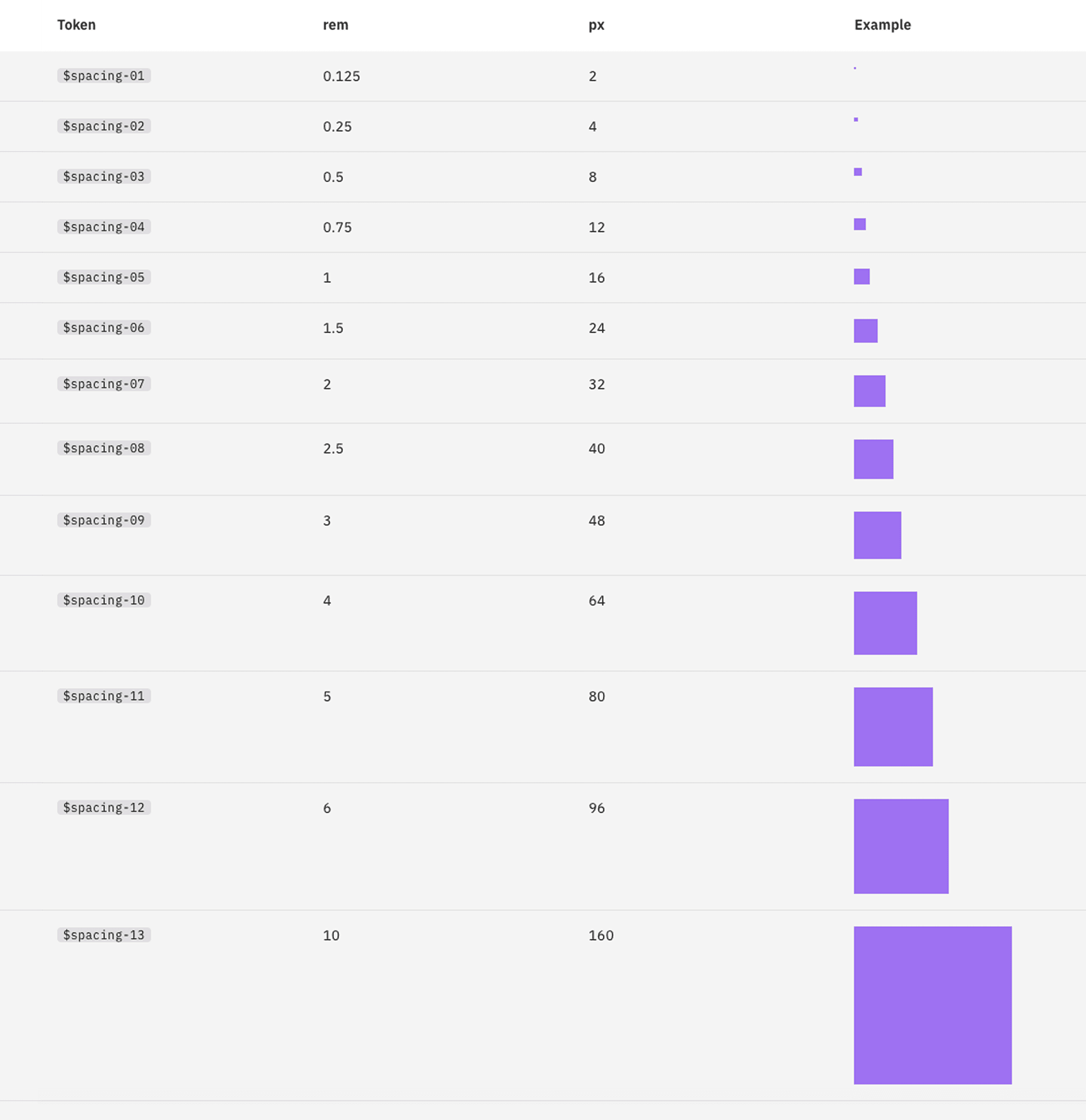
The IBM type scale is built on a single equation. The formula for their scale was created to provide hierarchy for all types of experiences, and assumes that y₀=12 px
b. Define and use a clear typographical hierarchy
When you look at something that has been physically printed, you'll see that there's a clear hierarcy. Take a newspaper front page for instance. There's large headlines, followed by straplines and in some cases, subheadings, body text, correspondent information or labels and sign-offs. This is so sighted users can quickly scan and understand content that's relevant to them.
Similarly, whether for websites or apps, a clear hierarchy for headings, subheadings, body text and labels helps give screen readers the information they nee to convey structure and context.
When hierarchy is inconsistent or when everything is styled visually but not semantically, screen readers lose the ability to navigate in an efficient way. They can't differentiate between sections or understand which information is to be read out first.
Clearly define text roles like H1, H2, H3 - H6, body text, captions, labels)
Use them across all screens or flows
Avoid headings that are created only with font size and weight

The Carbon Design System for IBM defines both fluid and fixed heading and body copy styles to be used on a case-to-case basis.
c. Optimise fonts, spacing and line length for reading
Certain products, such as fintech ones, often prioritize information density over readability. When overly condensed, tight line spacing or long line lengths are used, it becomes harder to parse text, espcially for users with cognitive impairments. Even for fully sighted users, or those with dyslexia or visual fatigue, dense text means more effort and more room for error.
For comfortable reading, your product should have:
Fonts that are not overly decorative or condensed.
Comfortable line heights, such as (~1.5x the font size) for paragraphs
Comfortable line lengths such as 45-75 chars per line
Sufficient white space is not wasted here. It allows users to slow down, double-check information and read instructions carefully, which, in the case of fintech apps, is exactly what the tasks demand.
d. Make sure text can be enlarged without breaking the experience
This is one of the most practical mid-cycle tests you can run. While using relative units enables text to scale, testing at larger sizes tells you whether the rest of the system is actually prepared for that scaling.
Increase text size to 200%, or zoom the interface significantly, and see what happens. Does content reflow? Do buttons grow with their labels? Do values stay visible?
Increasing text size should not cause clipped information, overlapping labels, hidden CTAs or broken forms. On mobile, this often means allowing text to reflow instead of truncating aggressively, or offering in-app options for larger text. Locking text sizes may preserve layout integrity, but it does so at the cost of accessibility and independence.
5. Focus indicators and visual feedback
In the service of minimalism and visual polish, focus indicators are often one of the first things teams remove. Default browser outlines can feel clunky or out of sync with the rest of the UI, so they get stripped out. And because the product still appears to work when you’re using a mouse or touch, it’s easy to assume nothing is broken.
But for users navigating with a keyboard, switch device, or assistive tech, focus indicators are the only way to know where you are on the screen.
Keyboard and switch users move through an interface sequentially. Instead of pointing at elements, they tab through them. Without any visible focus indication, users can't tell:
Which button is currently selected
Which link will activate if they press Enter
Whether focus has moved at all
Here's what you can do to ensure accessible focus indicators:
Restore focus visibility, even if you have to custom-build it
In case your DS had default focus outlines removed, the fix isn't to bring them back unchanged, it is to replace them with something equally visible or better.
Every interactive element, such as links, buttons, inputs, dropdowns, and cards, should show a clear visual change when focused (hover, active, disabled) via keyboard. This could be:
An outline
An underline
A border
A background change
A glow or shadow
These need not be different from your brand guidelines, and easily be a part of your visual language. If you’re customising focus styles, make sure they have sufficient contrast against surrounding content, are visible at different zoom levels and don’t rely on colour alone to be noticed. A pressed button should look pressed. A focused element should look selected. A disabled element should look unavailable, even if you strip colour away entirely.

Google’s Material Design 2 buttons had a height of 36dp and slightly rounded corner radius.

Material Design 3 default buttons have new color mapping, are taller at 40dp and have fully rounded corners.
b. Make focus states consistent and system-owned
Mid-cycle, this shouldn’t be handled ad hoc. Different components can have different focus treatments: buttons might show a glow, links show an underline, and cards might have a border, but those decisions should be documented and standardised in the design system.
This does two important things:
gives users a predictable navigation experience
prevents teams from accidentally removing or weakening focus styles in new work
Focus behaviour should live alongside hover, active, and disabled states in your component specs, as a first-class interaction state.

Toggle states of buttons in Google’s Material Design 3 - A: Unselected, B: Selected
The simple test:
Try using your product without a mouse. If you ever lose track of where you are, focus indicators aren’t doing their job.
The simple test:
Try using your product without a mouse. If you ever lose track of where you are, focus indicators aren’t doing their job.
Interaction ease and information order
This part of accessibility is less about what’s on the screen, and more about how easy it is to interact with it.
Can actions be triggered without precision? Does navigation continue to be familiar and predictable? Does content appear in an order that makes sense, no matter how someone is accessing the interface?
Here's what you can do about it:
Make click and tap targets forgiving
Small interactive targets are one of the most common friction points in live products.
Buttons that look fine visually can be frustratingly hard to activate if they’re icon-only, tightly packed, or rely on precision. This disproportionately affects those with motor impairments, tremors, limited dexterity, or anyone using the product one-handed or on the move.
A common guideline is to aim for tap targets of at least 44×44px on touch devices. In practice, this often means increasing padding rather than making icons bigger. In fintech apps especially, important actions like pay, transfer, or confirm shouldn’t require careful aim. If an action is critical, the interface should be forgiving.
This is one of those changes that improves usability for everyone, not just accessibility users.

Google’s Material Design 2 buttons had a height of 36dp and slightly rounded corner radius.
b. Keep navigation predictable and consistent
If your app uses navigation bars, menus, or tab bars, keep their placement and order consistent.
Users with cognitive or memory challenges rely on stable patterns to orient themselves. When navigation moves around, changes order, or behaves differently across sections, it increases cognitive load and uncertainty.
In fintech products, this is especially important. Users are already juggling mental models of accounts, balances, transactions, and outcomes. Keeping navigation placement and order consistent across Accounts, Payments, Investments, and other sections reduces friction and helps users build confidence over time.
c. Make sure visual order matches logical order
What looks logical visually doesn’t always match what assistive technologies perceive.
It’s common for content to be visually repositioned using CSS, for example, placing a summary card in the top-right while its actual position in the DOM is much later. Sighted users see one thing, while screen reader users end up experiencing another.
This mismatch can be deeply confusing as important information might be announced late, out of context, or not at all. To fix this:
Check that the DOM order follows a logical reading sequence
Ensure key information appears early in both visual and structural order
Use ARIA landmarks (like role="main", role="navigation") to help users orient themselves
Think of accessibility as a contract enforced by the design system
What design uniquely controls is the contract of interaction: what signals mean, how content is structured, how predictable movement feels, and how forgiving the interface is when users don’t behave “perfectly.” When those foundations are solid, accessibility stops being an add-on and starts becoming a property of the product itself.
Most of the barriers discussed here aren't always created by neglect. Sometimes, they're a consequence of design choices that seem reasonable while being made under pressure, choices that worked well for many users, but somewhere excluded others.
The good news is that these decisions can be changed. Design systems can be strengthened. Interfaces can become more tolerant without losing clarity or intent.
One way to understand what good defaults look like is to study mature design systems where accessibility has been a consideration at every stage, as we have done here. Large, widely-deployed products need to cater to scores of users, and have good takeaways even for smaller, tactical products.
This piece focused on design because design is where accessibility capacity is either built or constrained. Engineering work will always be necessary to fully realise these changes, and we’ll get to that next. But without the right design decisions in place, even the best technical fixes struggle to scale.