We wanted to build a dark mode for an existing design system. The system had been built with tens of design files and hundreds of flows already in active use. The first task in the exercise was figuring out how to make it happen. The entire system had been set up using styles in Figma rather than variables, which made the process more complicated. Variables can hold multiple values across modes, which is what actually makes switching between light and dark mode screens possible. Styles, on the other hand, are much more rigid. This meant the colour system itself had to be first migrated from being linked to styles to being linked to variables before any dark mode work could begin. The main objective was to figure out a process and set up a foundation that could scale while also allowing for the least amount of manual work from designers.
Scripts made more sense here than live AI prompting
All existing colours were set up as Figma colour styles. To switch between light and dark using modes, they needed to be variables instead. Scripts were chosen over doing this through MCP, since it meant anyone who later works on the project can run the script themselves instead of having to prompt AI every time. The Figma plugin Scripter lets you save them to run again whenever needed.
Two scripts handled the migration:
Script 1 - Create variables from colour styles:
Reads every existing colour style and creates a matching variable from it, with both Light and Dark modes initialised to the original value. Dark mode values get worked out and updated separately.
Script 2 - Swap colour styles to variables:
Finds every node using a colour style and rebinds its fill/stroke to the matching variable instead. But, this didn't fully resolve it. Several layers weren't linked to any style to begin with, so these had to be identified and fixed manually. The Design Lint plugin is useful here to quickly fix unlinked colour and text styles.
Dark mode colour values were settled group by group, not through a single formula
Generally, going from light mode to dark mode is about tweaking the hue and lightness, and AI can do that once it has the colour values. But instead of letting AI apply one formula across the board, colours were handled group by group, since greys needed different treatment than brand colours, which needed different treatment than pastels. Claude was used to generate dark mode values for each group based on the rationale provided, with manual adjustments made wherever a value didn't look right. Contrast ratios were also checked by Claude before any value was locked in, catching several issues early rather than after the fact.
1. Primary brand colour
Changed minimally to preserve brand recognition. Some steps required no adjustment, as their existing lightness already met legibility requirements against a dark background; others received a small lightness increase, sufficient only to maintain visibility.
Primary brand ramp compared across light and dark mode, where most steps hold their original value and only a few gain lightness.

2. Secondary brand colour
Same preservation principle applied, with slightly more flexibility given its lower frequency of use. All steps required a lightness increase since the original values were too dark to read clearly against a dark background. Hue was held constant across all steps to maintain the colour's identity rather than shifting it toward a different tone.
Secondary brand ramp with every step lifted in lightness while the hue stays fixed.

3. Mid-range greys (cards and input fields)
A direct mathematical conversion produced a blue-leaning tone, so these were adjusted toward a neutral grey to avoid an unintended blue cast.
4. Text grey ramp
The relationship between light and dark mode values here is inverted relative to background tokens: the darkest greys in light mode map to the brightest values in dark mode, preserving the original visual hierarchy. Steps used for strokes and fills rather than text are treated as exceptions and remain darker in dark mode.
Grey ramp inverted for dark mode, with the darkest light-mode steps mapping to the brightest dark-mode values.

5. Indicative colours (error, success, warning, info)
Stayed more or less the same since they held up well in dark context without adjustment. Warning required particular attention: reducing saturation even slightly caused the colour to read as dull rather than a clear alert, so saturation was kept close to its original value across the ramp.
Error, success, warning and info ramps carried into dark mode with saturation held close to the original so alerts still read as alerts.

6. Pastels
The priority was retaining their identity as pastel tones rather than converting them into standard dark surfaces, with a small proportion of white blended in to soften the tone without losing colour character.
Pastel set in dark mode, softened with a small amount of white so the tones stay pastel instead of flattening into dark surfaces.

Shadows needed a separate pass for a different reason
Shadows had their own problem on top of being styles instead of variables: most of them weren't plain black with opacity, they used a lighter tinted colour. That works fine in light mode, where the tint still reads darker than a white page. In dark mode it breaks, since a light tint sitting on a dark surface no longer looks like a shadow, it shows up as a glow instead. Since they were also set up as effect styles rather than variables, they had no way to hold a separate value per mode to begin with.
Shadow behaviour across light and dark mode.

Two scripts handled this as well:
Script 3 - Create shadow variables:
Reads every shadow layer across effect styles and creates a matching variable, with both modes initialised to the original value.
Script 4 - Swap shadow styles to variables:
Rebinds each shadow to its corresponding variable, with the dark mode value set to solid black at an adjusted opacity instead of the original tint. Opacity values were adjusted individually per layer to preserve the intended depth.
MCP came in at the fine-tuning stage, not the migration stage
With the base set up, Figma MCP was connected with Claude so adjustments could happen back and forth without copying scripts manually each time. Once connected, updates could be pushed straight into Figma instantly. This made adjusting individual shades and comparing options side by side significantly faster. A base set of screens was assembled covering most of the use cases across the product to test the system against.
Some things only surface once you toggle modes on actual screens
Once everything was linked to variables, modes were toggled across the screens to see what actually broke in practice. Mismatched tokens that didn't swap correctly, colours that worked fine in isolation but looked wrong in context. None of these was obvious when reviewing values on their own and only surfaced once the screens were seen in both modes side by side.
Real screens toggled side by side in both modes to surface tokens that failed to swap.
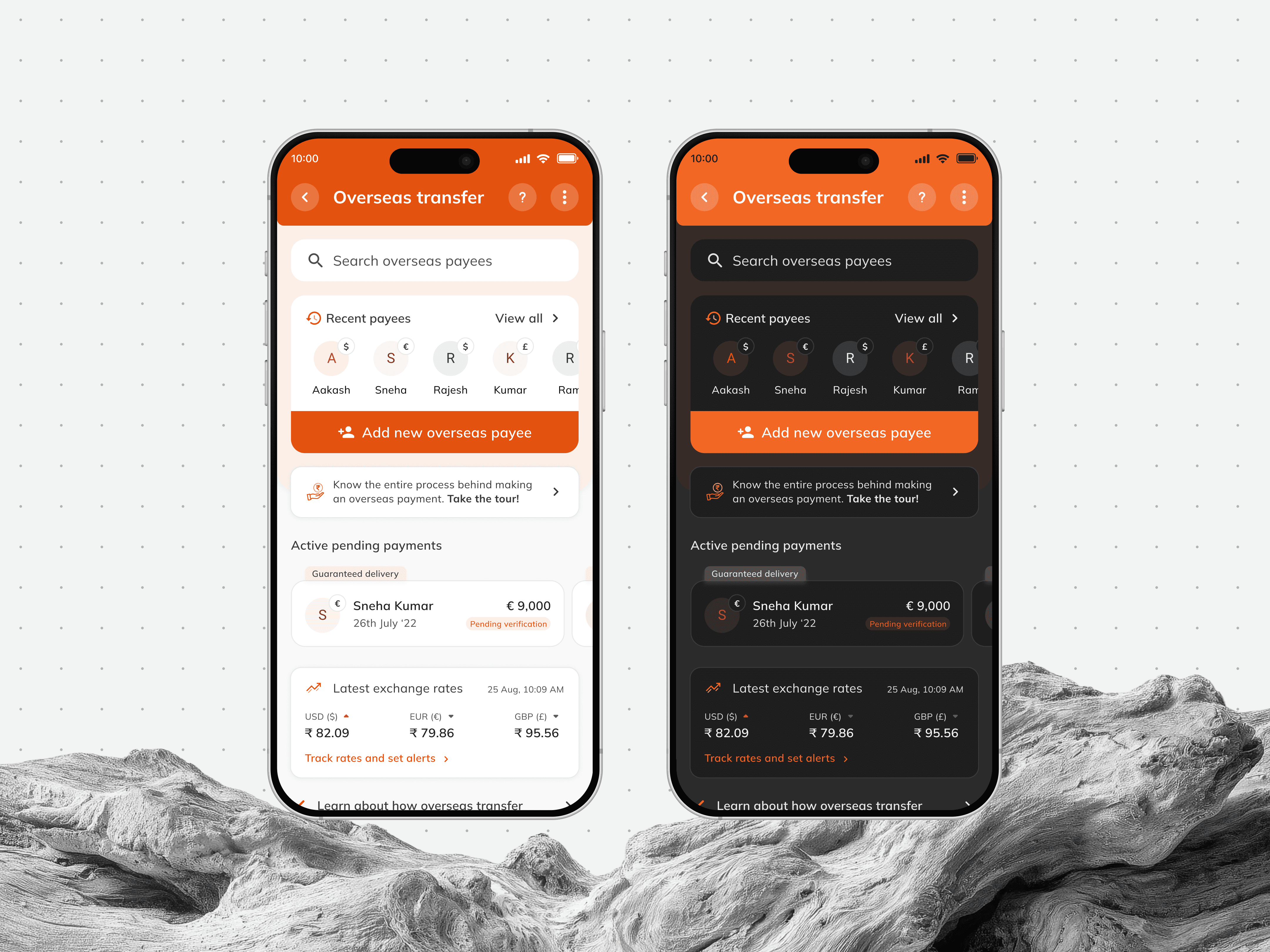
The most significant issue: white flips to black by default in dark mode, which works for most elements, but elements sitting on top of the primary brand colour are meant to hold their appearance regardless of mode, and these broke as soon as modes were switched.
The fix: Introducing a dedicated colour token that stays constant across both light and dark mode, meant for elements that needed to sit outside the mode-switching system entirely. Bank and third-party logos where a separate dark variant isn't feasible were handled the same way — retaining their background using the constant token, preserving legibility without requiring a dedicated dark-mode asset.
Real screens comparison to figure out colours that could only look wrong in context.

The practical takeaways of the exercise
This exercise clarified exactly where AI is useful in this kind of work. Claude could write the scripts, generate the colour ramps, check contrast, and push updates through MCP, anything where the logic was already defined, and the task was execution. What it couldn't do was define the logic itself. Whether warning colours needed saturation preserved, whether a grey was reading as blue in context, whether an element should adapt or stay fixed. Those decisions had to come first from a designer, and Claude worked from them, not toward them.
The practical takeaway for future projects: the speed gains are real, but only if the decision-making happens before handing work to AI. Going in without a clear rationale per colour group would have produced faster output that still needed to be redone. The process that worked here was: define the rule, let Claude execute it, review the output in context, and adjust. That sequence is repeatable on any legacy system of similar scale, rather than a one-time output.