









Aditya Birla Capital Digital
We were revamping the design system for India's second-largest bank, serving a user base of roughly 3 crore people. The brief wasn't just visual, it was to capture the essence and magnitude of a legacy institution while making the experience feel timeless, modern, and unmistakably consistent across web, mobile, and tab.


Sustaining the change of scope
A system sized for the original scope doesn't automatically hold when the scope changes underneath it, most break, or get patched with exceptions until they're unrecognizable. Sustaining that meant treating scope creep not as a threat to the system, but as the actual test of whether it was built right in the first place.
Built to last
A system built during a brand refresh can't just solve for the brand as it is on day one, it has to be resilient enough to survive what the brand becomes slowly. That meant building at the token level, not the surface level: decisions that could absorb a new palette or wordmark without every component needing to be rebuilt from scratch.
Co-ordinating a WIP brand
Partway through building this system, Aditya Birla Capital Digital went through a brand refresh. We absorbed the bulk of that new look and scaled a system in a way that it could hold it’s truth across multiple platforms. Which is why the design system and guidelines later played a significant role in shaping Aditya Birla Capital as well
Enhance ABCD's brand identity by showcasing brand colors during memorable instances to reinforce the brand's style. Each color has a designated role that conveys a specific meaning within the interface. These defined color roles simplify future modifications and customizations.

A
a
Anek :
Regular, Semibold, Bold
Optimising typography is optimising readability, accessibility, usability, and overall graphic balance. 95% of design is generally typography.





The ABCD-DS Grid is based on contemporary best practices and provides a flexible, platform-agnostic system for laying out components on-screen. It acts as the geometric foundation of all the visual elements on-screen, from typography to boxes, cards, icons and illustrations.


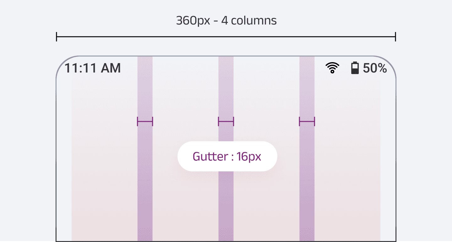


The grid provides the foundation for harmoniously positioning elements while maintaining a consistent and coherent look on the screen. A consistent grid creates a cohesive experience that enables visual hierarchy and facilitates the readability of elements on-screen.