Building a system around

Building a system around

Building a system around

legacy

legacy

We revamped the design system for India's second-largest bank, serving a user base of roughly 3 crore people. The brief wasn't just visual, it was to capture the essence and magnitude of a legacy institution while making the experience feel timeless, modern, and unmistakably consistent across web, mobile, and tab.


What ICICI Bank stands for

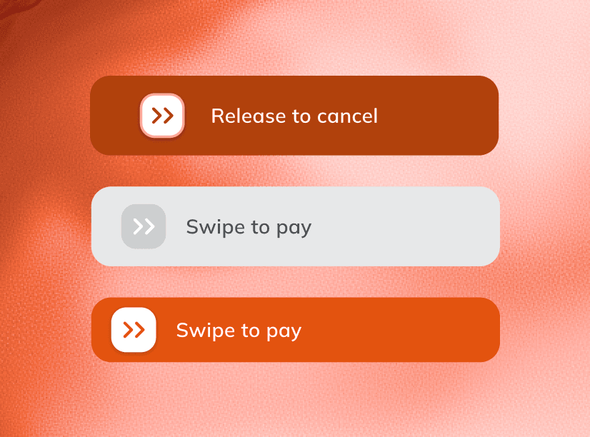
The most important part of iMobile was of course, the payment related pages. We remade the flow from the ground up, and introduced a lot of features into the process

The most important part of iMobile was of course, the payment related pages. We remade the flow from the ground up, and introduced a lot of features into the process

Cleanliness

as a brand trait.

The most important part of iMobile was of course, the payment related pages. We remade the flow from the ground up, and introduced a lot of features into the process

Click on an image to switch

Cleanliness

as a brand trait.

The most important part of iMobile was of course, the payment related pages. We remade the flow from the ground up, and introduced a lot of features into the process

Click on an image to switch

Building blocks

It's easy to think of a design system as something that just helps you scale faster. It takes longer to see it for what it really is, the foundation everything else stands on. For an institution this size, getting that foundation right isn't routine work. It's a small number of teams anywhere that get to do it at all.

It's easy to think of a design system as something that just helps you scale faster. It takes longer to see it for what it really is, the foundation everything else stands on. For an institution this size, getting that foundation right isn't routine work. It's a small number of teams anywhere that get to do it at all.

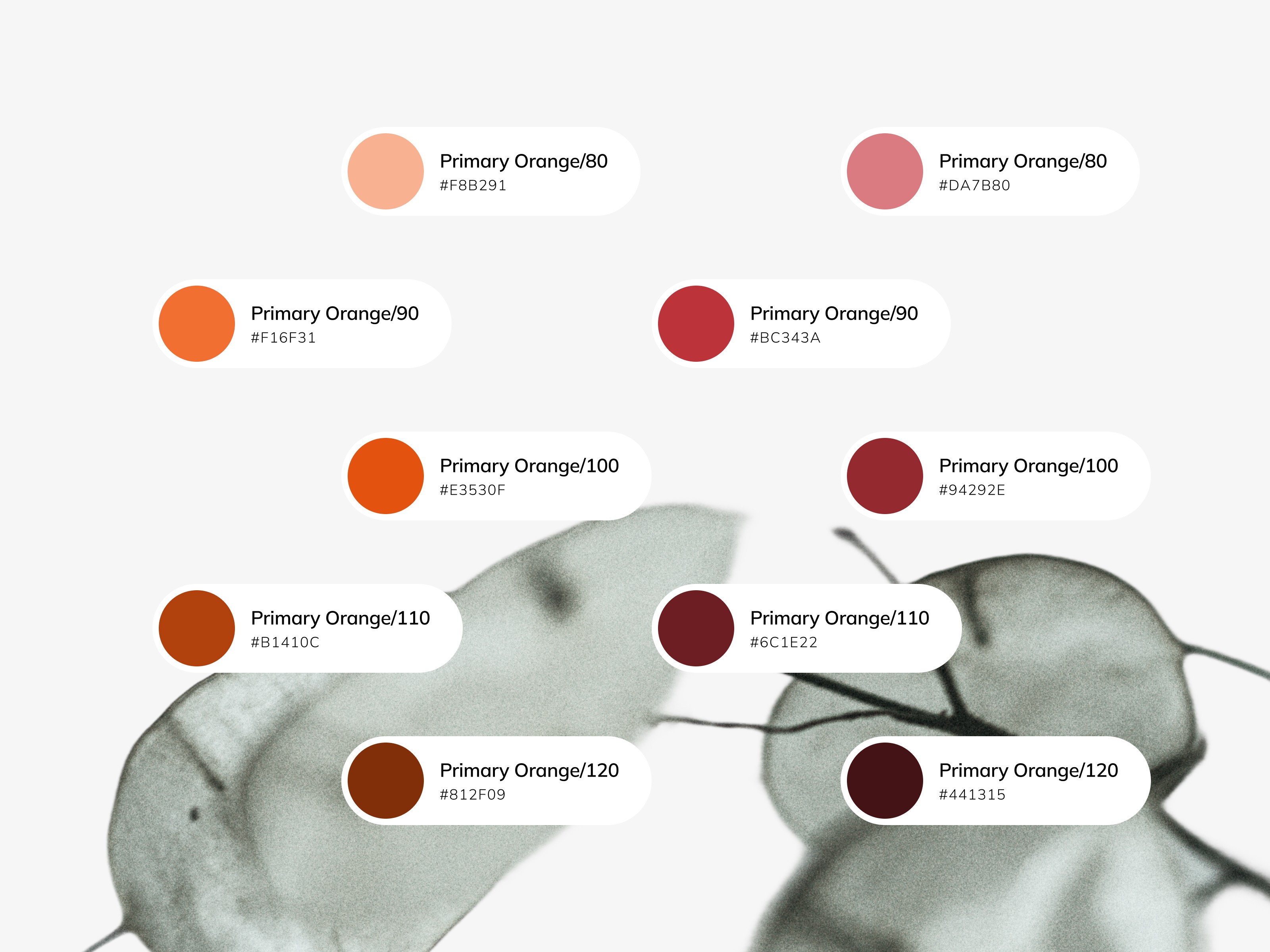
Colors

Colors

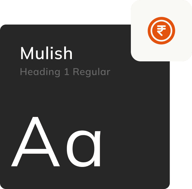
Typography

Typography

Grids

Grids

Icons

Icons

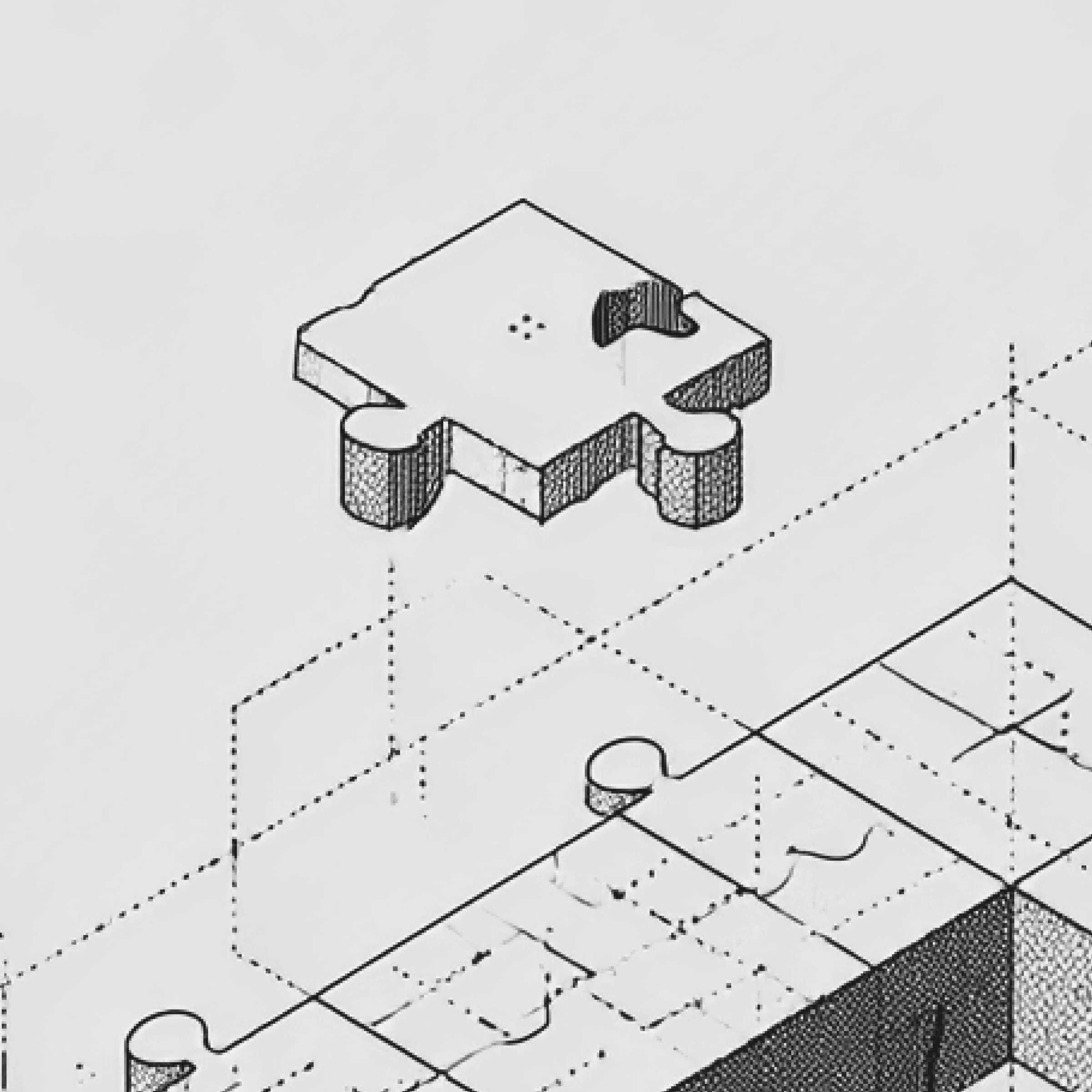
Blueprint

Deep rooted design decisions

Deep rooted design decisions

When a product team asks for a template, they're not asking to skip design they're asking for the decision to be baked in, so the next team that picks this up ten screens later doesn't have to guess

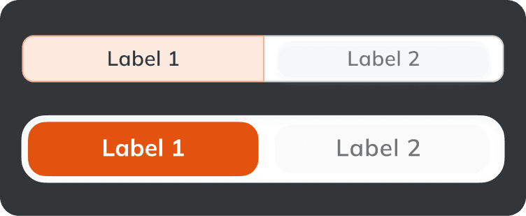
We built a set of distinct drawers, each with a clear purpose and hence a clear visual distinction. This included not just - success, warning, alerts drawers but also mini-success drawers, re-confirmations and highlight drawers.

We built a set of distinct drawers, each with a clear purpose and hence a clear visual distinction. This included not just - success, warning, alerts drawers but also mini-success drawers, re-confirmations and highlight drawers.

Documentation and guidelines

Being able to communicate the design system is just as important as building a robust one

Being able to communicate the design system is just as important as building a robust one

The reason a decision gets written down at the system level, rather than left as a one-off screen choice, is almost always because it happened once, got questioned, and needed an answer that could outlive the person who made it.

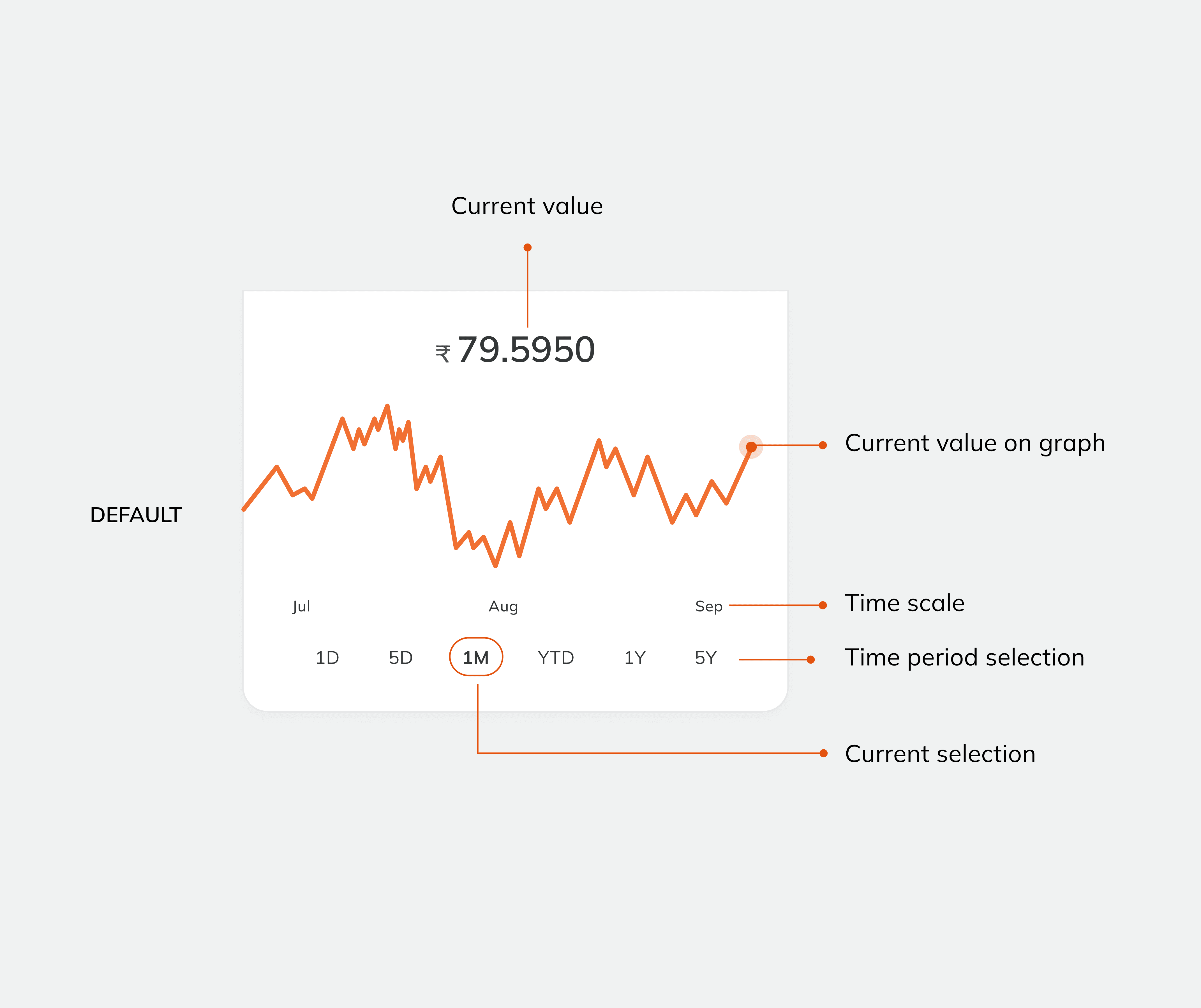
A design system's documentation isn't a style guide in the decorative sense. It's a record of arguments that were already had, so the next team doesn't have to have them again, and doesn't quietly undo them either.
Broad brush strokes on a canvas

Let’s build together

We’re always open for exciting work and genuine connections. Feel free to drop us a line of follow us on our socials for updates

Broad brush strokes on a canvas

Let’s build together

We’re always open for exciting work and genuine connections. Feel free to drop us a line of follow us on our socials for updates