

Imagine this scenario: you're doing something ordinary like sending money or confirming a payment. The screen hangs, something loads or doesn't, and you're not quite sure what happened. Should you refresh or try again... you wonder if you've sent the money twice. After a second or two, this resolves, and you move on too. Most people will recognise this moment, a flicker of uncertainty, a bit of panic, then relief when it sorts itself out.
But for many disabled users, this kind of moment doesn't resolve. The interface never quite confirms what happened, what will happen next, or what a particular action means in a way that is comprehensible and conclusive.
We've been here before
24 years ago, to be exact. What if we told you that the design problems with accessibility that were identified in 2001 still show up today in banking and payment apps in India?
In 2001, Dr. Jakob Nielsen of the famed Nielsen Norman Group studied how people with visual and motor disabilities used everyday websites. He was interested in where routine actions fall apart when vision or motor ability isn’t a given.
What he observed then rings true even today. But while the interfaces have moved from websites to apps, the breakdowns have also followed along, and this is especially true in the Indian context.
Design problems with accessibility that were identified in 2001 still show up today.
What was the Nielsen report, and what did it set out to do?
In the US in 2001, a 140-page report called ‘Beyond ALT Text: Making the Web Easy to Use for Users with Disabilities’ was published by Dr. Nielsen. It presented the results of usability testing with more than 100 participants:
Those who were blind and used screen readers or Braille devices
Those who had low vision and used magnifiers
Those with impaired mobility, who used trackballs, footpads and modified keyboards.
Alongside, a smaller control group of sighted users completed the same tasks for comparison.
Participants were asked to do ordinary things on US and Japanese websites, such as find information, move through pages, and complete forms. The idea was to observe where people succeeded and where they failed, revealing crucial gaps in design.
What emerged was important: you’d think that the problems in accessibility were obscure or technical. But they weren’t. Instead, they came from everyday design decisions about how structure is conveyed, how actions are explained, and how feedback is communicated, assuming every user is able-bodied.
What changed from 2001 to 2025?
Today, the landscape looks very different from 2001. We have formalised standards like WCAG 2.2, and accessibility tooling is more mature. Screen readers, mobile operating systems, and browsers on both web and app platforms are far more capable than they were two decades ago. And yet, when you line up the 2001 Nielsen report with findings from Indian banking apps in 2024–25, the same categories of accessibility failures reappear, even though so much has improved significantly.
Major errors across homepages of the top 100 companies in the Indian finance sector, as found by a 2024 study:
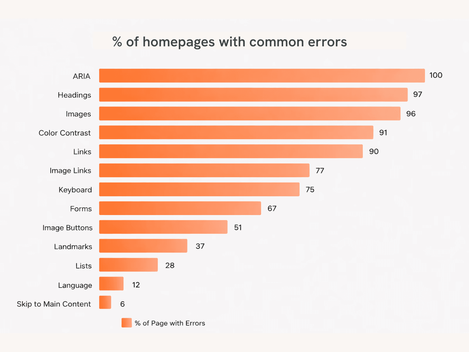
The study was done using an automated tool to measure accessibility as per WCAG 2.2 by BarrierBreak, a private accessibility consulting firm, and NCPEDP, a cross-disability non-profit organisation.
Visit link
5 top issues with Indian banking platforms in 2025
These issues are mapped against learnings from 2001.
1. Unclear or unlabelled controls
Present design assumes visual literacy first, accessibility second. Icons are treated as “universal,” even though screen readers can’t interpret intent without labels.
Nielsen (2001):
Users could activate buttons and links but often couldn’t tell what action they would trigger, especially when labels were missing or ambiguous.
What we still see in Indian banking apps (2025):
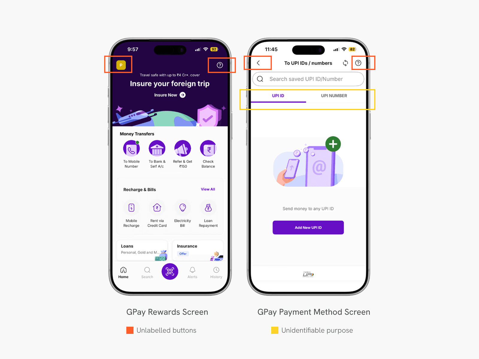
Icon-only buttons for key actions (Scan, Pay, Confirm, Retry) announced as generic “button” elements that leave disabled users unsure of their intent
OTP input fields announced as “edit box” with no instruction, so users are unsure how many digits are required or what state they are in.
No cue for where to ‘scratch’ for scratch card-based rewards
90% of Indian finance-sector platforms had link accessibility issues, including non-descriptive or missing labels.
100% of audited platforms showed ARIA-related issues, indicating poor programmatic labeling
Impact:
Visually impaired users are unable to complete payments independently. Many rely on memory or external help for routine tasks, which is risky and impacts their freedom.
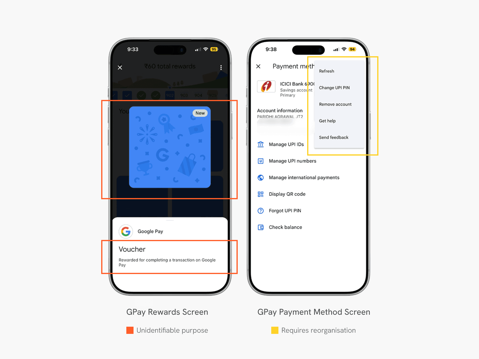
In a study, while trying to change the UPI pin, an issue almost every participant faced was locating the option to do so. They had to navigate through multiple menus to find it, as it was hidden in the secondary Kebab/More menu.
Loss of structure and orientation
Most design systems are optimized for visual consistency, instead of semantic structure. Accessibility is often layered on after layouts are finalized.
Nielsen (2001):
Users with disabilities struggled to understand where they were on a page or how content was organised once visual layout cues were removed.
What we still see in Indian banking apps (2025):
Missing or incorrect heading structures on web dashboards
Inconsistent focus order on mobile apps (screen readers jump unpredictably)
Deeply nested menus for critical actions like PIN reset, transaction history, or dispute resolution
Impact:
Screen reader users cannot scan or orient themselves. Tasks that take seconds for sighted users can take minutes, or become impossible, leading to higher rates of task abandonment.
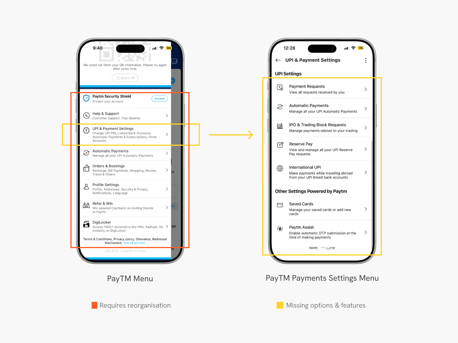
Almost all participants in this study faced some kind of difficulty in locating the correct option and had to navigate through multiple menus that were not ordered keeping a hierarchy of information in mind for the unsighted. One of the participants had to take hints from the researcher to perform the action as they felt frustrated by going inside each menu to eventually find themselves in the wrong one.
Visual-only feedback
Visual feedback is faster to design and review. Non-visual feedback is often deprioritized because it’s harder to demo internally.
Nielsen (2001):
Errors, confirmations, and state changes were often shown visually but not conveyed programmatically, leaving users unsure whether tasks succeeded.
What we still see in Indian banking apps (2025):
Errors indicated only through red outlines or warning icons
Success/failure states shown visually, without audio or haptic confirmation, such as QR-scanner screens that don’t announce state changes like ‘scanning’, ‘failed’, ‘success’.
Graph-heavy dashboards with no textual summaries
Impact:
Users with low vision or color blindness miss errors. Blind users don’t know whether a transaction succeeded, leading to mistrust and repeated actions.
Complex workflows break assistive technology first
Security and compliance flows are designed in isolation from accessibility teams.
Nielsen (2001):
The more steps, conditions, and edge cases a flow has, the more likely it is to fail for users with disabilities.
What we still see in Indian banking apps (2025):
Multi-step KYC flows with face detection, blinking, or camera alignment
CAPTCHAs with no accessible alternatives
OTP + timeout + resend logic that isn’t announced clearly to screen readers
Impact:
Users are locked out at onboarding itself. In extreme cases, accounts are denied access because users cannot perform visual verification tasks. The alternative becomes to visit brick-and-mortar branches, which might not also be built in the most accessible way.
Accessibility failures are usability failures, amplified
Accessibility is still treated as a “special case,” not a stress test for mainstream usability. Mobile-first design optimises for speed and density, not varying degrees of motor ability or alternative input methods.
Nielsen (2001):
Accessibility problems rarely affect only disabled users, they expose deeper usability flaws.
What we still see in Indian banking apps (2025):
Poor contrast affects elderly users and outdoor usage
Small tap targets affect users with motor impairments and large-screen phones
Confusing flows increase error rates for everyone, not just assistive-tech users
Finance-sector platforms showed an average of 91.55 accessibility errors per home page.
Impact:
Banks lose users who are not officially “disabled” but still struggle, such as seniors or first-time digital users who may have low digital literacy.
What we should do next
At the end of the day, it isn’t that designers or teams haven’t tried. We have better standards, better tooling, and far more capable assistive technology than we did in 2001. We have the ability to build truly accessible digital products. And yet, accessibility is still framed as compliance without lived usability, not as a way to understand how products behave under real-world conditions.
The persistence of these problems matters because banking and payments are not peripheral systems. They’re how people access money and move through the world. When accessibility fails here, it does more than slow someone down or create inconvenience; it takes away their independence.
We’ve always had guidance, and we’ll continue to see recommendations and frameworks emerge. What’s missing is follow-through.


