


Digital product design, at its core, is an act of translation. We’re constantly trying to synthesise the real world into a two-dimensional interface on a screen. When we spoke earlier in the piece about photography, it was the same idea: how do you look at the world and notice the things you’ve technically seen a thousand times, but never really observed?
Observation starts out as a conscious, deliberate effort. You slow down, you pay attention, and over time, it becomes second nature.
We move through our days surrounded by objects, systems, and interactions, but true observation only happens when you pause to ask why things are the way they are, how they operate, and what’s really going on beneath the surface. When you do that, you start seeing nuance. You begin detecting patterns and mismatches. If you want to get nerdy about it, you start understanding how things are put together.
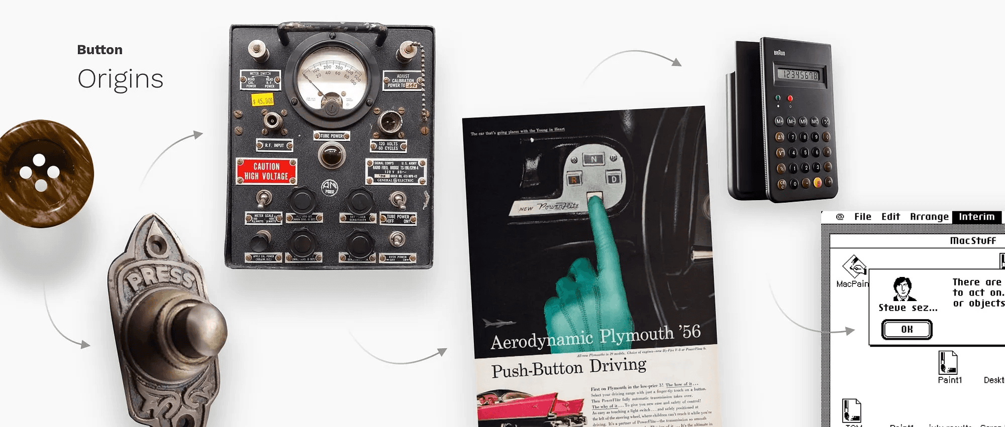
Even something as mundane as pressing a button carries a surprising amount of complexity in the real world. There’s physics involved—the optics, the textures, the CMF (colour, material, finish) of it. When you engage with a switch, there is a tactility to the act. A physical switch has weight, resistance, and also feedback.
Nine times out of ten, you don’t need to replicate that literally in a digital interface. But when you have the luxury to indulge, even briefly, in paying attention to those details, you end up with more thoughtful, more beautiful products as a consequence.
We all know what a button is supposed to look and feel like by now. We interact with millions of them every day on our phones. But if you really observe a physical switch: the heft, the way it moves, the moment it clicks, how it resists or yields: you start to notice things that can meaningfully influence digital behaviour. How shadows behave when a button is pressed. How light interacts with a surface depending on how your finger covers it. These details may seem minor, but they add up.
More often than not, you won’t get the chance to work at this level of indulgence. But there is an entire world of design that is indulgent by nature. And as we become increasingly saturated with apps and digital interfaces, there’s a noticeable movement back towards skeuomorphism and more realistic design. In that context, observing the real world becomes critical. You can’t emulate tactility unless you’ve taken the time to really notice it.
Take a slider, for example. Digitally, it moves left to right along an axis. Simple. But a real-world slider has heft, it moves smoothly in some places and clicks in others, there’s some amount of resistance—that’s feedback. By sitting down and truly observing that behaviour, by internalising how it feels, you’re far closer to emulating it digitally when the opportunity allows.
And that matters, especially today. Thanks to design systems, scale, and consistency, the unintended side effect is that most apps now look and feel the same within a category. Banking and payments apps end up looking the same. Social media apps look the same. The interaction patterns and visual cues are familiar. We all recognise the same icons, the same paradigms.
When you’re trying to build something that feels noticeably, visibly different, the real world is often the best place to look. There’s no shortage of inspiration around us. The problem is that we rarely stop to observe it.
To do truly good work, you have to slow down and look.
A renewed interest in replicating the real world through skeumorphism
It’s not that we need to go back and emulate the real world wholesale in digital interfaces. There is something to be said for the fact that the real world and digital interfaces are inherently different, and they should inherently have different modes of expected interaction.
Part of this growing movement toward skeuomorphism, or at least interfaces that mimic reality, comes from the fact that we’ve gone through over a decade and a half of simplifying things to their absolute base denominators.
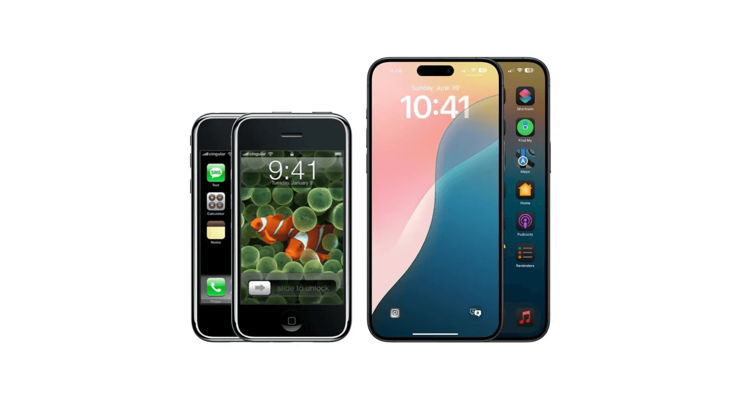
When apps first started coming out, around 2008-09, the iPhone had just come out, app stores were booming, Android was entering the market, and touchscreen interfaces had just popped up. Entire businesses were being formed on the back of being able to touch a piece of glass. If you look back at early iOS, it was extremely skeuomorphic.
The form factor was so novel that designers wanted people to feel familiar with what they were engaging with, because inherently it was alien. Typing on a touchscreen keyboard versus a QWERTY keyboard—even a BlackBerry-style physical keyboard—removed a sense of tactility. Even if you were faking it with haptics, it was still strange. So the idea was to make things look as realistic as possible. A notepad looked like a yellow legal pad, complete with felt stitching on the edges.
We went through a few years of that before a realization dawned: digital and physical are inherently different. And that led to people asking—why are we trying to emulate reality inside something that is not reality?
Around 2012–13, iOS 7 arrived. Apple, being the torchbearer of design at the time, introduced flat design. Clean, minimal, function-over-form interfaces followed. Over the next few years, the entire digital design landscape moved in that direction.
From iOs 1 to iOs 18 (source)
As products scaled and large businesses grew, consistency became critical. Design systems entered the chat. We’re now at a point where it’s never been easier to put together a good-looking login form using a design system.
But the flip side of simplicity is proliferation.
When something becomes easy to do, you start seeing it everywhere. Given how much we live on our devices and engage with the world through them, there’s a saturation that comes from seeing the same things over and over again. And like anything else, design is cyclical.
When touchscreens were new, skeuomorphic interfaces were novel and fun. Then they got long in the tooth. Flat design came in, felt fresh, and now flat design is getting a bit long in the tooth. So we’re swinging back toward more skeuomorphic ideas until something else inevitably comes along.
The other part of this is simpler: sometimes it’s just fun to do interesting things. Sometimes you don’t want to design what you design all day long. It’s never been easier to put together a login form, but what if that login form involved physically unlocking a lock?
There are developers, builders, and tinkerers experimenting with ideas like that. Sometimes they’re just fun. And I love those kinds of apps. I have a weather widget on my phone that’s essentially an entirely 3D modeled, game engine-driven weather app. Do I need it? No, I already have a weather app built into my phone. But it’s fun. It’s delightful.
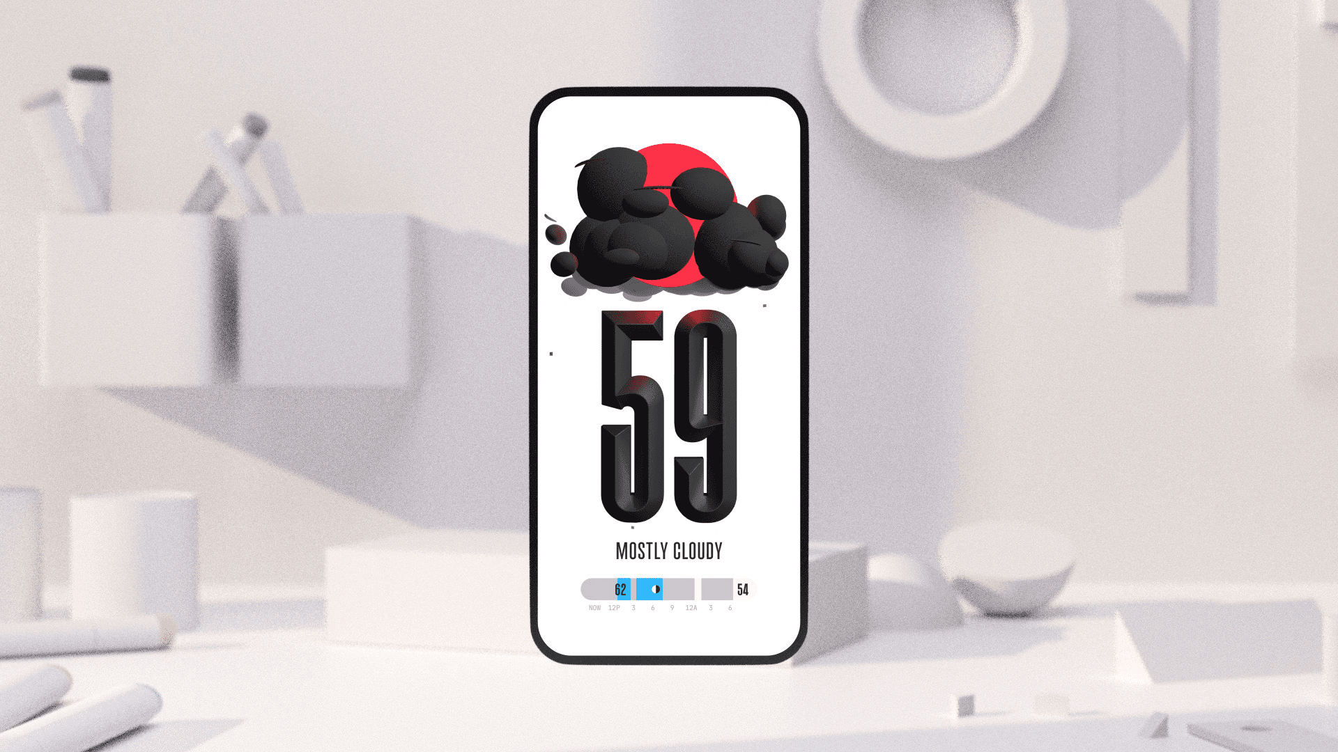
The (not boring) weather app
And to do things like that, to create that kind of delight, you need to look outside your usual sources, which brings us right back to observing and really looking at the world around us.
Turning observation into real product decisions
Observing is more than just about seeing things for what they are. It’s also a way of challenging assumptions. It’s a way of asking why did that person do the thing that they did, or why did that particular event occur in the way that it did. A lot of that comes from watching people engage with things. How does that translate to the work? It shows up in the little things.
For example, watching an older, less digitally savvy person engage with their devices. As young people who are designing interfaces and are very savvy with technology, there are a lot of assumptions that we make about how a product needs to work, based on our understanding of how products work. That understanding might be very different from how my parents, for example, engage with technology.
Taking a second to sit and watch how they engage with the same app that I might be using gives you insight into how you could design those products in a way that is a lot more intuitive for that cohort of users. You get past superficial things that you might gather from documentation, research, or secondary opinions. Yes, superficially, you'd think that font sizes need to be larger because of reduced vision potential. But there’s a lot more nuance to that conversation.
We were recently working on a specific version of a dashboard aimed at senior citizens, a dashboard that already existed and people were already using, but we had to optimise it explicitly for that cohort. There are obvious fixes: make everything bigger, chunkier, easier to read. But when you slow down and observe how that set of users engages with the product, you start noticing subtler things.
It can be something as simple as the language you use. Do you call it “support” or do you call it “help”? Do you call it “call” or do you call it “contact”?
On the other end of that spectrum, beyond visibility concerns, what happens with mobility impairments? What happens when someone has difficulty inputting an MPIN or accurately tapping a button, maybe because they have shakier hands? And this isn’t even about a specific medical condition like Parkinson’s. It could just be age-related shakiness.
If you don’t design around that, if you don’t provide affordances that allow them to hit the part of the screen you expect with sufficient accuracy, you will fail in your mission of making a dashboard optimized for senior citizens.
And that’s exactly what we did. We sat down, watched how people engaged with the product, and designed those affordances based on what we observed.
False empathy, real insight, and why observation matters more than simulation
Often times, when you're designing, you have to avoid the trap of a false sense of empathy, in the sense that you may over-empathize, but not actually come up with solutions that are practical.
The best way to address something like that is to work with people who have the lived experience. Yes, have a consultant, and bring in expertise. But most importantly, observe people who are actually using the product, because their experience and their way of navigating something is going to be very different from someone who is trying to emulate that experience artificially.
We often start from the base assumption of ability. And it’s not until we’re faced with the problem that we realise the tap target is too small, or the interaction isn’t as clear as we thought. You don’t necessarily have to be afflicted with the same condition or walk a mile in someone’s shoes in a literal way. Observation alone gives you far deeper insight than any report or research document you might read.
There’s a common mantra among researchers: observe what the participant does, not what they say.
If you ask someone whether they understand something, out of a perceived sense of intelligence or a desire to not appear silly, they will often say yes. They’ll tell you they understood it, they’re fully on board, it makes sense, it’s intuitive.
And then you hand them a device or a prototype. And you observe: the micro-expressions, the hesitation, the struggle… things they will never articulate, especially after they’ve already said they understand. There is a lot to be gleaned from that. That’s where you figure out what actually needs to be optimised because no one wants to admit they’re not able to understand something that everybody else seems to do easily.
Good friction, hesitation, and what usability tests really reveal
It’s really fascinating from a usability testing and research perspective as well. When you give a participant a task to complete, you ask them to walk you through what they’re doing so you have both quantitative and qualitative insight. But what’s often more revealing are the small, almost invisible moments, the hesitation before a tap, the slight furrow of the brow, the tensed expression that betrays worry. Especially in the kind of work we do, which involves sensitive banking information, people are already slightly on the defensive. You are in a very different headspace when you open a weather app versus when you open your banking app.
Those small cues give you far more insight than you might expect, and they’re easy to miss if you’re not deliberately looking for them. More often than not, users will eventually complete the task. If it’s a standard flow that exists elsewhere and they’ve done something similar ten thousand times before, they’ll get there.
But the real question isn’t whether they completed it. It’s how they completed it. Did it make sense to them? Did they have to pause and rethink how to operate the product? Did it demand more cognitive effort than it should have?
There is a time and place for healthy friction. But more often than not, you don’t want your user to have to think. The mantra for product designers is simple: you do the hard work so the user doesn’t have to. And that only becomes visible when you observe the nuanced behaviors, not just the words spoken aloud by the participant.
An appreciation for whimsy can make the day-to-day work more enjoyable
More than I can count, I’ve found things that inspire me and then tried to get the rest of the team equally excited about them.
The weather app I mentioned earlier is part of a series called Not Boring--(Not Boring) !Weather, (Not Boring) !Camera, and so on, by a designer-developer named Andy Allen. They’re phenomenal apps built purely for whimsy and delight. They are overkill. They are over the top. And that excess is precisely their charm.
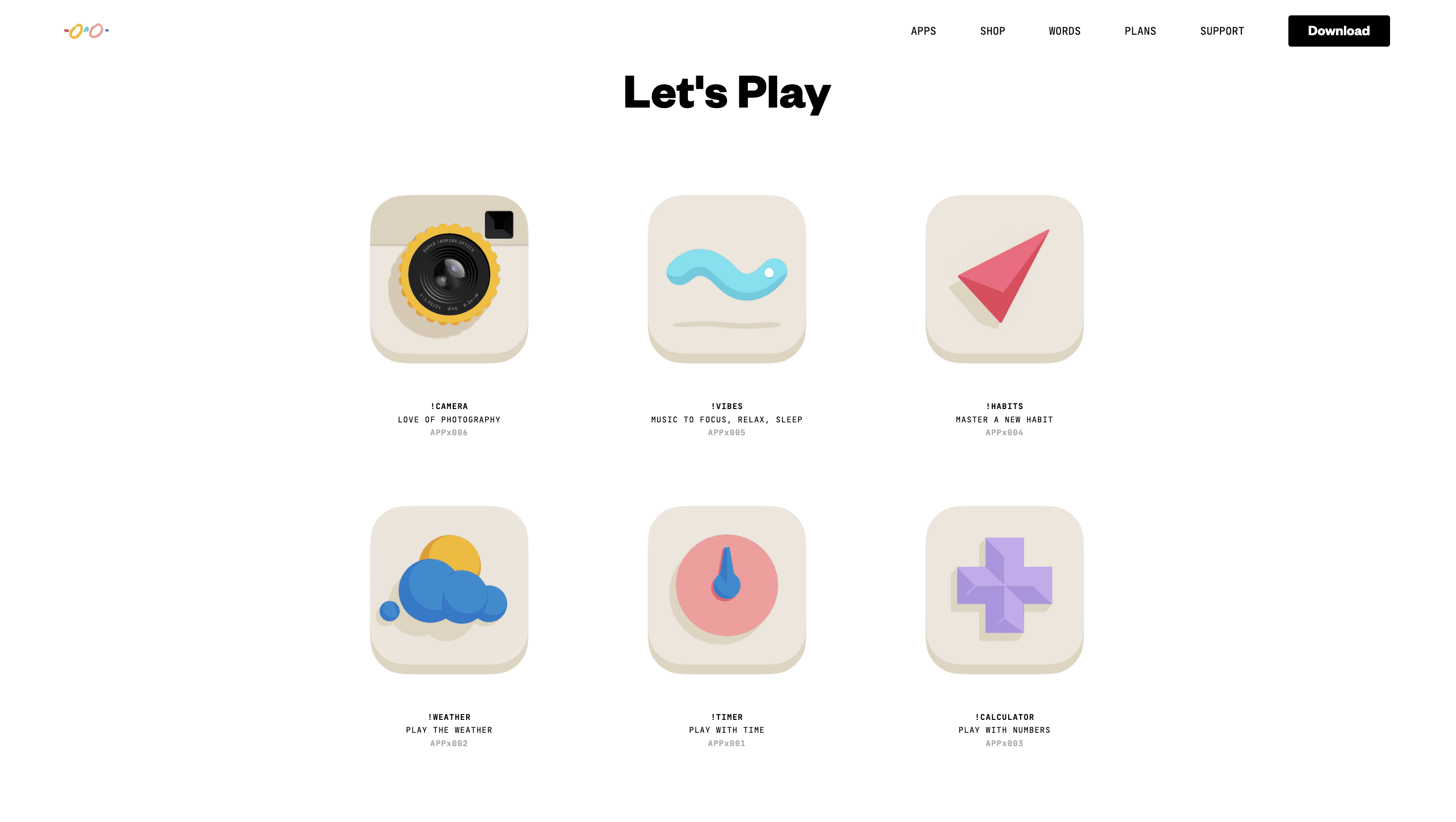
The (not boring) suite consists of several apps dedicated to being delightful.
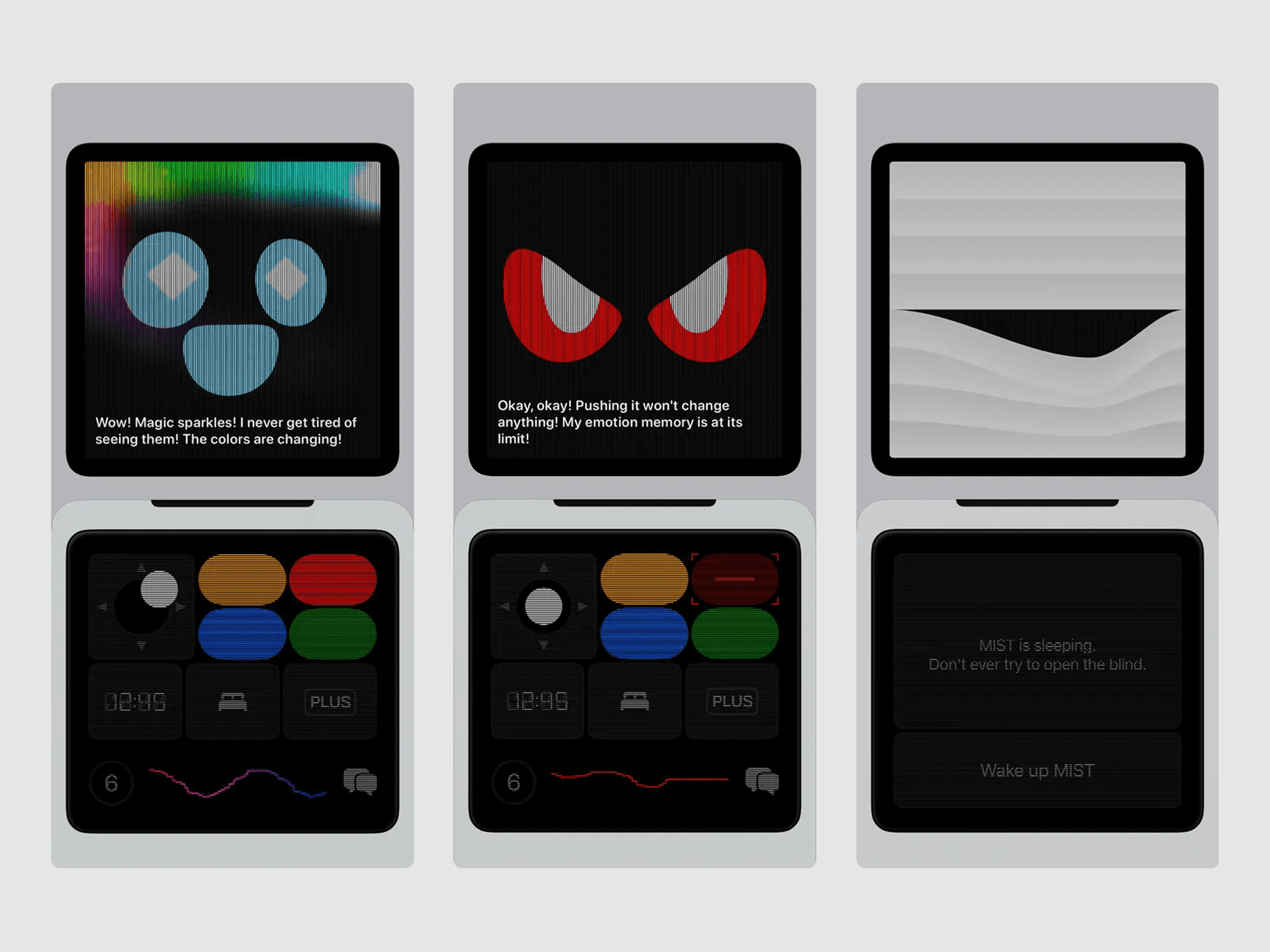
Then some apps don’t even serve a clear purpose. They just exist to be fun. There’s one called Mist, which is essentially a little talking desk toy. I have my phone propped up on my desk while I work, and it just sits there emoting and reacting in the background. There’s now a subscription layer with LLMs plugged in, so you can talk to it. It doesn’t exist to optimize a workflow. It exists to be delightful.
Even more utilitarian tools can carry that same playfulness. I could stream ambient music off YouTube while I work, or I could use something like Poolside FM, which turns ambient listening into a retro, toy-like interface powered by SoundCloud. It plays thematic music, 70s, beachside cabana in Rio in the summer, wrapped in visuals that feel playful rather than purely functional. All of that inevitably shapes how we think about building moments of delight into otherwise straightforward flows.
A couple of years ago, we were working on a loan flow, the kind of thing we’ve built countless times. Typically, it’s a standard slider where you select an amount up to your eligibility. It’s functional. It works. But it wasn’t hitting the mark.
So we experimented. Instead of a linear slider, we built a radial dial, something you could spin, almost like a fidget spinner, but fully functional. We layered in haptics so that as you rotated the dial, you could feel it in your hand. It was slightly indulgent, maybe even a bit overkill, but it transformed an otherwise predictable interaction into something engaging.
The client loved it. It was fun to design, fun to test, and a meaningful shift from a flow we could otherwise assemble in ten minutes.
I’ve seen similar cross-pollination happen with the team as well. When we worked on a TV app for a streaming partner, a rare opportunity to design for a 10-foot interface, many of us leaned on our shared experience as gamers. Instead of defaulting to familiar mobile paradigms, we looked to console UIs for inspiration. We borrowed patterns designed for distance, scale, and immersion, and brought that sensibility into the product.
You don’t get to indulge like this every day. There are brand constraints, regulatory requirements, compliance considerations, and client preferences that shape what’s possible. But when there’s room to push, when there’s room to experiment within those bounds, that external inspiration bleeds into the work in ways that make it more engaging, and frankly, make the job more enjoyable.
Making informed design decisions in the presence of trends and platform shifts
When something like Liquid Glass crops up, you toy around with it, explore it and see what it's all about. In fact, clients are usually aware of larger trends like these too. When a design language comes from a company at Apple’s scale, coupled with the kind of marketing muscle they have, everyone has heard of it. You don’t even have to be an iPhone user, you’ve heard of Liquid Glass. In fact, when it was announced, we were asked by almost every client what we were doing about it in their iOS apps.
There are times when trends arrive in a big way like that. Other times, they’re more subtle, and we might nudge clients toward adopting something if it genuinely makes sense for their product. But the decision is never automatic, we weigh it carefully, thoughtfully.
With something like Liquid Glass, there are two parts to consider. One is platform consistency and convention: how much of it do you need to adopt so your app feels native, current, and aligned with the operating system? The other is practical constraint. Does it significantly increase engineering effort? Does it affect legibility? Does it meaningfully improve the experience?
Liquid Glass, for example, has serious legibility issues. That’s not something I’m comfortable introducing into a payment flow. It might work beautifully in a reading app, or an entertainment app where foreground and background separation is clear and visually rich. But in a banking app. where you’re looking at statements, transactions, dense financial information, it’s often black text on a white or near-white background. The marginal benefit of a shinier interface may not justify the engineering overhead or the risk to clarity.
And there’s another reality: if you don’t implement something like Liquid Glass well, it looks far worse than not adopting it at all. A poor implementation of a flashy design language can do more damage than restraint ever would. So the decision has to be informed, deliberate, and grounded in context.
Liquid Glass beautifully simulates how light refracts, but at the same time, can create legibility issues for critical products. Sidebar UI by Tanvir Ahammed Tamim
This applies more broadly to trends and platform conventions. Sometimes there are things you simply have to adopt because not doing so makes distribution harder: app store requirements, system behaviors, accessibility changes. The same is true on Android when Google introduces a new Material update. There will always be more features than you have time, budget, resources, or even a use case for.
Take Android’s personalized color theming. In theory, it’s lovely: your wallpaper drives your app’s color palette. But try having that conversation with a large multinational company with a strong, established brand identity. Just because your wallpaper is blue doesn’t mean their green app should suddenly turn blue. There has to be a genuine use case.
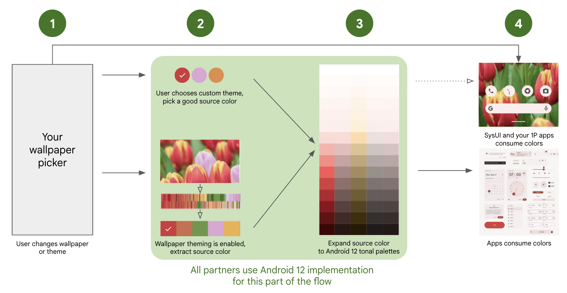
Android’s dynamic color system derives a color palette from the user’s wallpaper, allowing system UI and apps to adapt their themes automatically. But brand-driven apps often can’t often use it without compromising identity. Source
That said, in that same Android release, fluid widget shapes were introduced. Now that’s interesting. Breaking out of the rigid square grid opens up new surfaces to expose information or add actionability. Out of fifty new features, forty-five may not apply. The remaining five can open up genuinely new ways of engaging with an existing product.
These platform cycles happen every year, like clockwork. Web moves slower because it’s more mature, and patterns are a lot more established. We’re not reinventing the wheel every six months. But when big shifts do happen, you have to decide, and carefully, how much you incorporate and how much you leave out.
Tying this back to observation: you don’t get something like Liquid Glass without first observing how glass behaves. You have to understand its optical properties, refraction, reflection, how foreground and background interact. If you don’t understand that, you can’t meaningfully implement it. Apple may have done the heavy lifting, but you still need to understand how it impacts legibility and perception within your own product. That understanding only comes from observing, not just trends, but the world itself.
Distilling the zeitgeist for practice
The first thing I want to do is take a step back and break down the word itself. You might not always know every micro-trend across disciplines or subcultures, but the zeitgeist,by definition, is simply the predominant mood or belief of a particular period in time. Of an epoch.
It might show up as general apathy. It might show up culturally, in aesthetics, in fashion, in tone, in the kinds of products being celebrated. Geopolitics, war, economics, macro-economics, all of these shape it. In a recession year, people’s outlook changes. When global layoffs start happening, that changes the collective mood. When war dominates headlines, suddenly dressing in bright, flamboyant colors can feel out of sync with reality. These shifts affect the zeitgeist whether we consciously acknowledge them or not.
The key to distilling the zeitgeist is observation, not taking things for granted, not assuming that because you’ve seen something, you’ve understood it. It’s about pausing long enough to ask: Why did that event occur? Why is that person dressed the way they are? Why does this trend exist right now and not five years ago? You’re never going to know everything about everything; that’s physically impossible. But once you narrow your focus and start identifying niches, it becomes easier to keep your finger on the pulse.
Often, it’s as simple as looking around. What are people talking about? What’s the general vibe? The zeitgeist is that vibe.
There are moments in time marked by malaise and others by buoyancy and optimism. A few years ago, COVID was the defining mood, whether you were in London or Lucknow, you were sitting at home, anxious about the outside world. That was the zeitgeist.
On a more micro scale, it exists in your immediate environment. Your workplace. Your family. Your friends. What are they discussing? What are they worried about? How are they engaging with the world? If you pay close attention, patterns start revealing themselves. And some of that connects back to how people engage with products. But I’m not even speaking about it strictly from a product perspective. I continue to hold that to do really good product design, you have to look outside product design.
If the only thing you’re looking at is product, then this entire conversation becomes moot.
Looking under the hood of products is not optional
You can’t be a designer unless you understand how a product is built. It’s something we hammer into every designer on our team. You don’t have to become a developer yourself, but you do have to understand how it works because if you don’t, you will assume. And those assumptions will either be suboptimal, leading to a suboptimal product, or worse, flat-out wrong.
That usually means one of two outcomes: significant rework to bring things back in line with what is feasible and achievable, or something goes out broken and ends up exasperating the user. It happens more often than product-makers like to admit.
Knowing how a product is built under the hood is foundational. But choosing to see how the world works outside of digital products, that’s still optional for many designers. It shouldn’t be, but it is. If all you ever look at is the one thing you do every day, that’s a disservice to the work. You don’t make a good product unless you understand how the world works.
Being interesting takes more than a single-track mind
The best product designers aren’t talking about Figma all day. The best photographers aren’t staring at the works of Henri Cartier-Bresson all day. The best filmmakers aren’t endlessly watching Spielberg. The best work, strategically speaking, comes from an assimilation of sources.
It comes from a hot pot of interests, passions, reality, and constraints all thrown into a bottle and swirled into perfection.
As a creative person of any kind, you need to be looking at far more than you think you should. To have a visual vocabulary, or an auditory vocabulary, if you’re a musician, you need enough source material in your head to build something that feels original. Because there is no such thing as truly unique work. Everything is a remix of something else. The original source may have existed hundreds of years ago, but it existed.
If everything is a remix, then the question becomes: what are you remixing? If you’re sitting in Figma community files all day, you’re remixing the same things everyone else is. Especially early in your career, when your worldview is defined by the tools you use. That’s the trap.
Look at industrial designers. The best ones aren’t just studying chairs, they’re studying anthropology, health, human behavior. A chair for an elderly person is inherently different from a chair for a baby, and every age group in between. Unless you understand all of that, you’re not designing a good chair.
The same applies to digital work. It’s not about directly mapping every external influence to your field. It’s about becoming more well-rounded and more interesting. You can’t be a boring person and do interesting work. Interesting work comes from interesting people, and the easiest way to be interesting is to cultivate a wide assortment of interests.
If all you look at are apps, you’ll make more apps. Then one day, someone asks you to make something “cinematic.” What does that mean if you’ve never engaged deeply with cinema? What does “whimsical” mean if you’ve never experienced whimsy?
It doesn’t mean you turn everything into a playground. (Sometimes it does, often it doesn’t). But you need to understand how to distill those qualities into your work. You can have a whimsical app, a whimsical chair, a whimsical hospital bed—it’s absolutely a thing. But to distill that essence, you need exposure.
And for that, you need to build your visual vocabulary, build the pillars that support the edifice you’re constructing. The wider your inputs, and the better their quality, the stronger your output, assuming you’ve done the work to develop the skill to shape it.
Observation sits at the heart of this. You can watch a film, or you can observe a film. Again, not every film needs to be observed. Sometimes you sit with a tub of popcorn and enjoy it, sometimes you revisit it years later and see entirely new layers because you’ve changed.
Observation never happens in isolation. It’s tied to the environment, to who you are, to your biases, your mood, the side of the bed you woke up on. Just by observing, you alter the outcome. We’re drifting toward quantum physics there—but that’s the point.
I'll try to illustrate with an example: I’ve always loved comics and graphic novels. and I read Asterix obsessively as a child. I still read them, and even now, I find jokes I never noticed before, layers I missed. These revelations come not because the source material changed in any way, it’s because my outlook and worldview has changed as I’ve grown, and experience more things. The cultural tension, the political jabs inherent to the comics - they’re a lot funnier now, than when I read them as a kid.
There’s a time to consume something as entertainment. And there’s a time to pause and ask: why is that sentence structured this way? Why does that character arc resolve like that? When you start doing this, it’s conscious. Over time, it becomes second nature, and that’s what makes you interesting.
Treat curiosity as a muscle you have to build
Interest doesn’t always come from utility. It often begins with affection. For me, it usually starts with something I know and something I like. Then I start digging deeper. I go down rabbit holes, finding things I've never heard of before, (inherently, I can’t know everything about everything—that’s a character flaw), digging, trying to find out as much as I can, assuming I find it interesting.
I'll hit dead ends or things that make me think, nope, don't have the time for this, or don't philosophically agree with this. But more often than not, these too, turn into rabbit holes.
Sometimes it’s a 3am jaunt across the internet, sometimes it starts with a book and inevitably leads to the internet. Today, we have enough devices around us that we can look up anything instantly. It might begin with reading or watching something, which triggers a flurry of questions, and then I'm off researching. Hours later, I’m wiser about both the original subject and a host of adjacent things I didn’t even know existed.
"I love design, but that doesn’t mean I need to do all of the design in the world. I love it as a spectator as much as a participant."
- Michael Bierut, 99% Invisible.
To be honest, when I say “research,” the word is doing some heavy lifting. Sometimes I’m just idling, and bored. I’ll go down a Reddit rabbit hole and come out the other end knowing far more than I ever needed to, even if it’s information I’ll never use--baroque art, macro-economic policies, honky-tonk music, what material the soles of my shoes are made out of. It doesn’t matter what you look up. At the end of the day, curiosity compounds.
Cultivating curiosity involves rabbit-holing
If you want to cultivate this habit, there are places that are almost designed for it. Wikipedia is probably the most magical place to engage in link surfing. Start with one link, and depending on whether you’re a new-tab person or a click-and-go-back person, you’ll either end up with a page full of purple links or 75 tabs open in a single window.
Other tools help too, you can ask a question, follow up with more questions, and dive deeper. There are links for further reading, and references are cited. Even today, nothing beats Google, and now, with AI everywhere, it has never been easier to go down rabbit holes.
Pick one word. One topic. Start there.
One thing I do personally, I read more than I scroll. On my lock screen, I have the Wikipedia widget. and from time to time, it throws up a random stat, a random story. I’ll see something I’ve never heard of, think “what is this?” and five minutes later I’m 17 links deep. If I have a computer nearby, I’ll immediately jump to it.
I’m also meticulous about curating my feeds. I’m a strong practitioner of “not interested.” A lot of stuff, I’ll brutally mark as “not interested’ to see less of it. When something genuinely fascinating appears on one of my timelines, I rabbit hole from there.
For design specifically, there’s no dearth of inspiration--Awward sites, old classics, niche blogs and Pinterest. I personally prefer more human-curated spaces, so I use Savee instead of Pinterest. Over the years, I’ve manually curated tens of thousands of pieces of inspiration, and I still discover new things through the people behind the work.
If I like ten things someone has saved or created, chances are I’ll like the rest of their taste too. That’s another rabbit hole. For modern digital design in particular, Twitter is still one of the richest places to look. Everyone’s on Twitter building, sharing and experimenting. There’s noise, yes, but between the noise, there’s genuinely good work.
In the end, rabbit holes aren’t just about accumulating facts. They’re about expanding your vocabulary. The more varied your inputs, the richer your outputs can become. And that habit, the willingness to follow interest wherever it leads, is what keeps the work alive.
Here are a few rabbit holes to lose yourself in:
1. Wikipedia: The ultimate rabbit-hole machine. Start with one article and follow the links. Better still, get the app.
Reddit: Niche communities discussing everything from obscure engineering details to cultural trends.
Pinterest or Savee: For curated inspiration boards and visual references across design, photography, architecture, and craft.
X (Twitter): Chaotic, but still one of the fastest places to discover designers experimenting with new ideas.
Awwwards: A curated archive of web design experiments and interaction patterns.
Are.na: A slower, more thoughtful space for collecting and exploring ideas.
YouTube: Long-form and short-form explainers on everything from industrial design to cinematography.
Google Arts & Culture: Museums, artefacts, and visual culture from around the world.
The work improves when we start noticing
Design doesn’t get better because we found a new pattern library. It gets better when we stop assuming and start noticing. Watch what people do. Pay attention to friction. Look at how the physical world behaves. Borrow from things that have nothing to do with “product design,” because that’s where the new vocabulary comes from. If all you study is screens, you’ll keep making the same screens. If you learn to observe, you’ll keep finding better answers.


