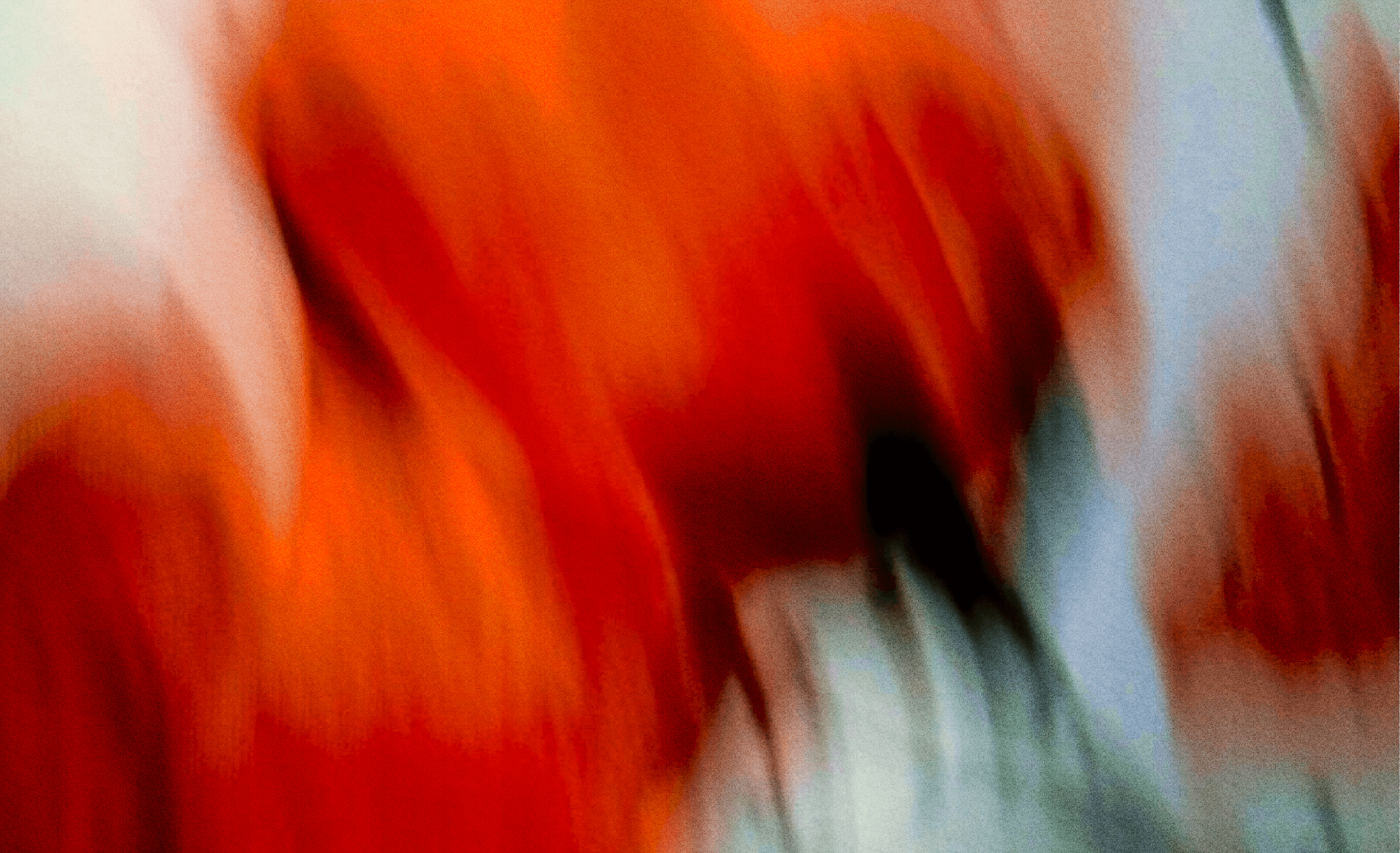
In contrast to the razor-sharp precision commonly associated with interface design services that we offer as a design studio, this approach introduces a subtle but solid sense of irregularity. It acknowledges that character often lives in imperfection. While structure remains essential, but it is tempered with the finesse of human led creativity.
A visual language that does not shout. It invites you to look closer.
At the core, our visual philosophy isn’t about theories, ratios, or over-rationalized explanations. It’s about creating visuals that simply feel right - calm, timeless, and human. A big aspect of building this identity was to understand how much we all rely on 'the story'. So the question was how do we design a visual language that allows you to pause and read the story
The truth about story-telling
There is no functional logic or pseudo-scientific reasoning. We're not trying to highlight a golden ratio. Beauty justifiably can just exist simply because it feels right; it doesn’t need over-explanation.
The challenge
As we developed the identity, one of the tensions we kept returning to was how to create something that felt tactile and grounded but functional


Characterised by nature
The idea essentially reflects depth rather than decoration. Every visual element feels grounded, tactile, and, intentional.
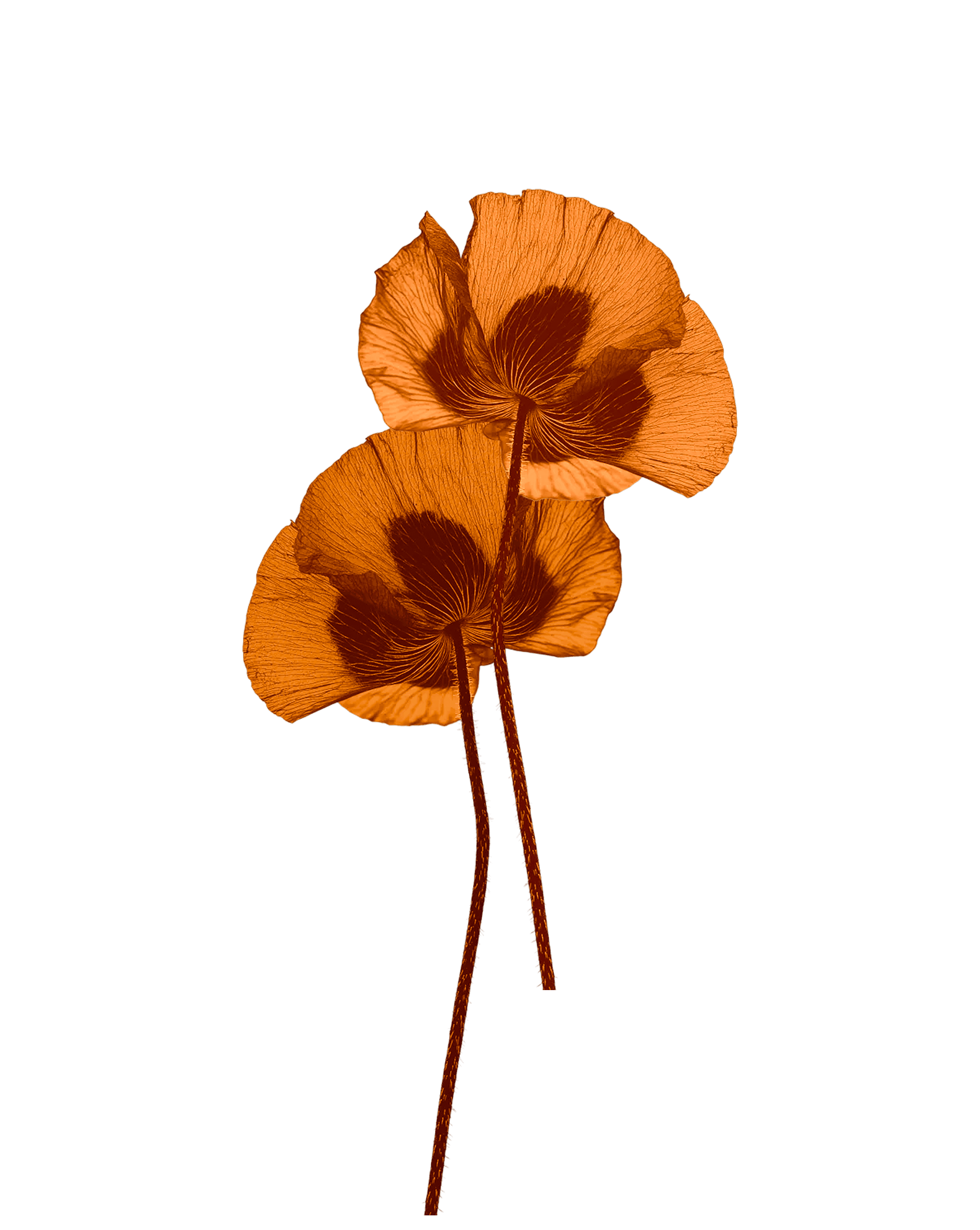
We found ourselves drawn to natural forms like rocks and flowers, and textures that felt tactile and real. They are what they are. And that way of being feels close to how we think about our work and how we communicate.
The practice
As we developed the identity, one of the tensions we kept returning to was how to create something that felt tactile and grounded without losing sight of who we are.


While we were exploring materiality and physical texture, we couldn’t lose also sight of the fact that we are, fundamentally a digital practice, and the work still needed to feel native to that world.

The Logo
Lorem ipsum dolor sit amet consectetur. Interdum id est nulla nulla cursus vestibulum dis euismod euismod. Lorem dui tempus convallis aliquam amet vitae eu nibh.
The interface is where our visual language becomes tangible, where form meets function
Our typography had to be a combination of sleek and meticulous with a touch of delight. Hanken Grotesk brings in the ground calm look. DM Mono carries forward the precision and meticulous look. Source serif 4 adds the touch of delight



For groundedness

Dm Mono
Regular, Medium
For precision
Uppercase, Under 14px


The characteristics
As we developed the identity, one of the tensions we kept returning to was how to create something that felt tactile and grounded without losing sight of who we are.
Leading lines
We needed a visible grid to counter the loose vacuousness of the visual language and hence the leading lines bring in the
Dotted lines
Dotted lines give the illusion of tactile/mechanical aspects of physical objects like perforations and blueprint dividers
Anchor points
Small shapes that anchor the visuals , highlighting the bounds of each floating or non-floating object